

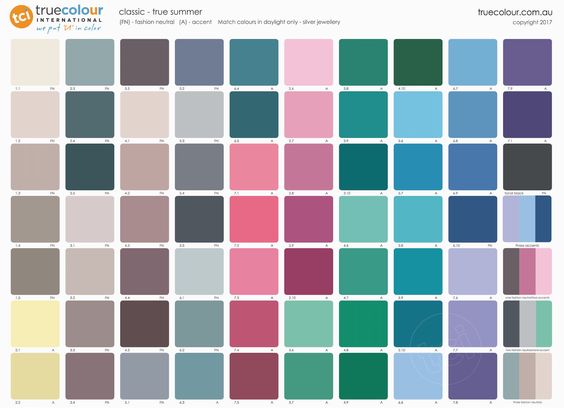
Not all Winters are created equal and other lessons in comparison
/Colour is so dynamic that trying to learn from a static palette is a challenge.
Sometimes it’s easier to see what happens when colour is scaled up in a real world context, transformed into clothes or lipstick, and having an interactive effect with actual people.
Maybe then we can start to recognise a Dark Winter from a True Winter, spot the differences between high and low chroma or learn the value scale.
And there is one lesson central to mastering this understanding.
What does good look like?
If we don’t know how breathtaking a Bright Spring looks in the Bright Spring palette, we might feel that True Spring or Bright Winter are as good as it gets.
Or we can misunderstand a colour dimension - like value - and start thinking a Dark Autumn light is the same as a pastel.
Maybe we settle for the broader season, rather than taking the time to differentiate our specific place in it.
This article is intended to demonstrate why it is always worth stretching ourselves that little bit extra to reach the extraordinary.
Please note:
In this post I’ve used pictures of celebrities as a lesson in comparison.
It can be tricky finding equivalent images with good lighting and resolution so think about the intent of the exercise rather than focusing on these details. The heart of the message won’t change.
As always, keep in mind that accuracy cannot be guaranteed based on photos alone so approach any advice involving celebrities as a learning tool.
Here we go!
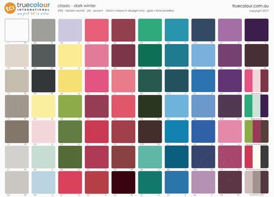
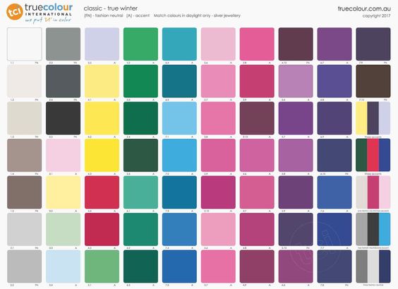
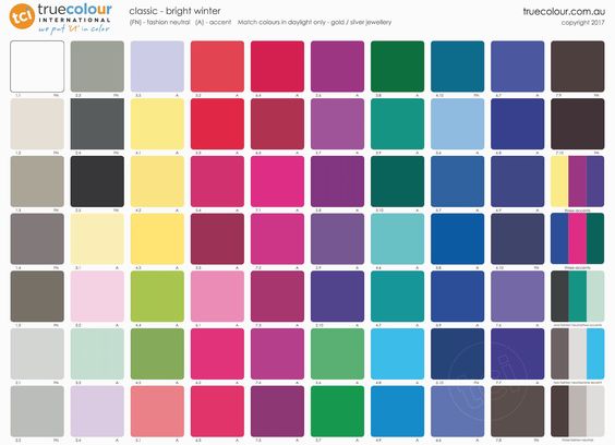
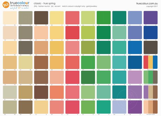
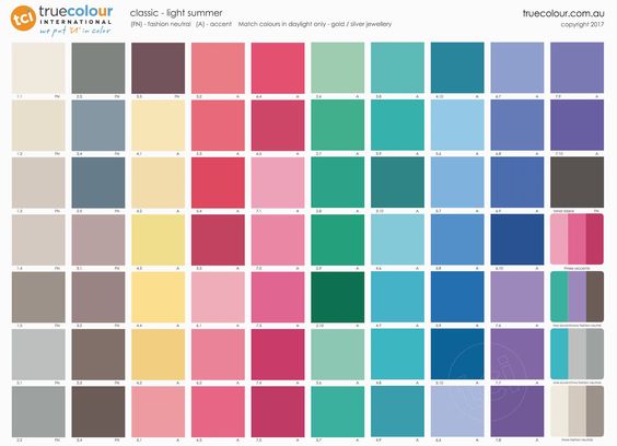
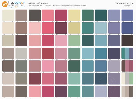
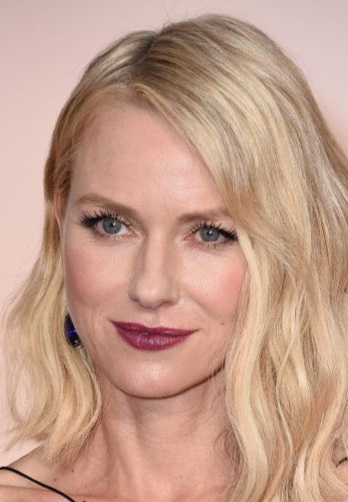
May I present three types of Winter:
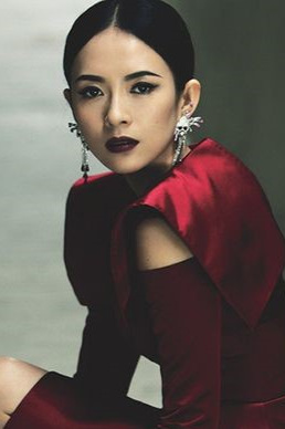
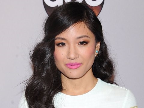
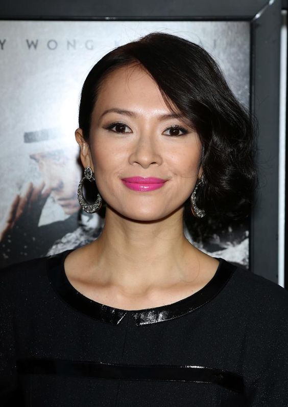
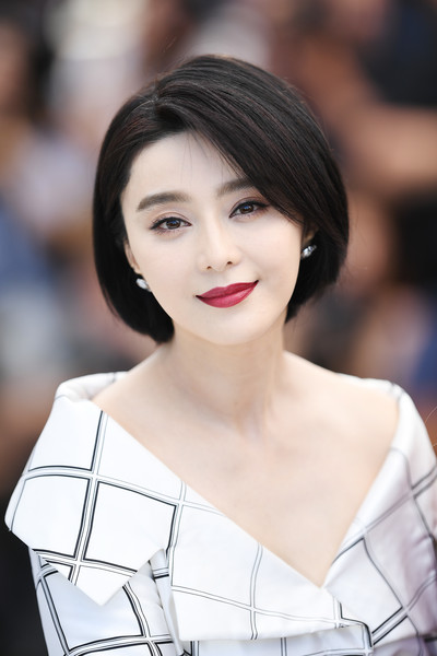
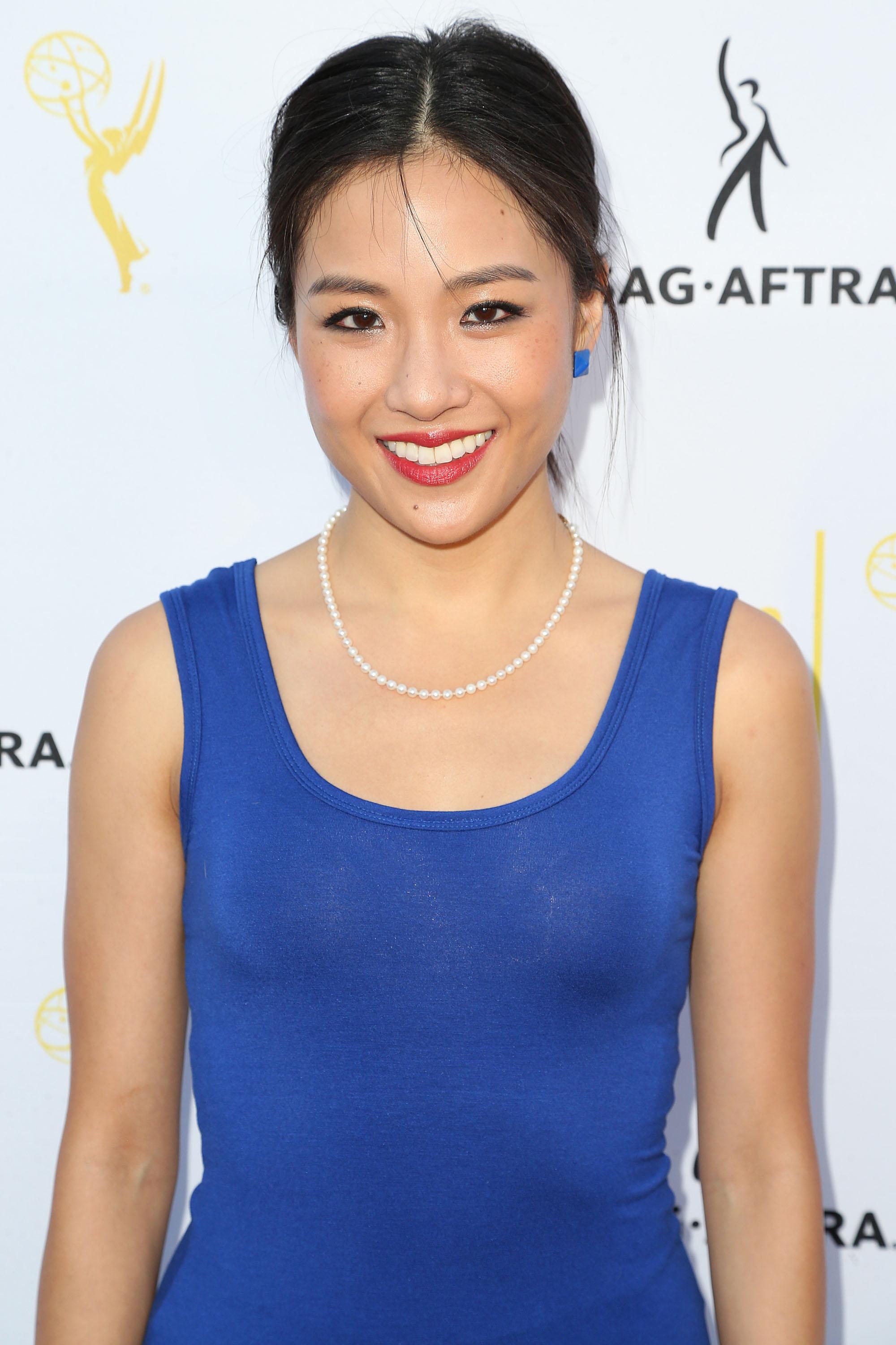
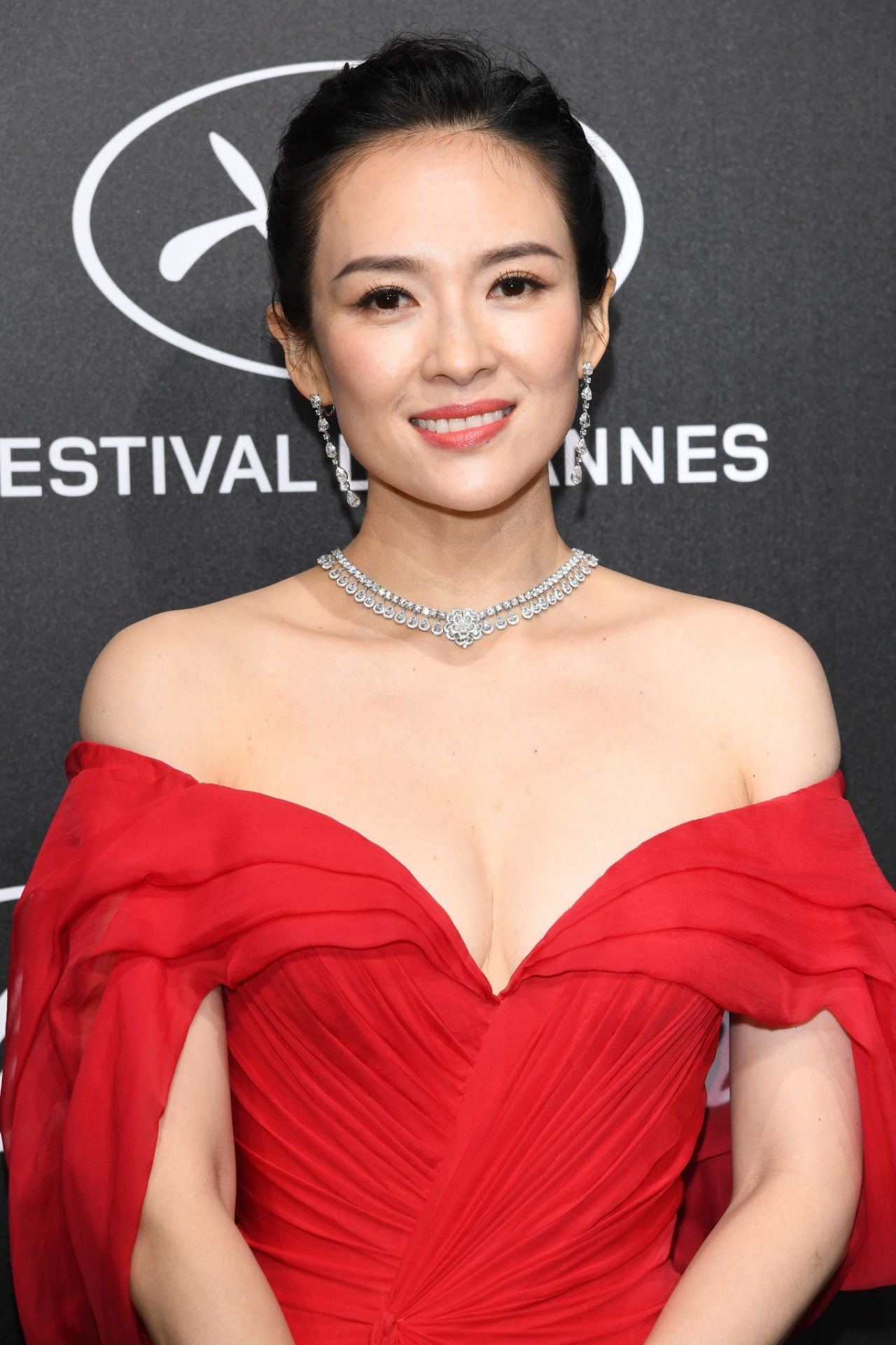
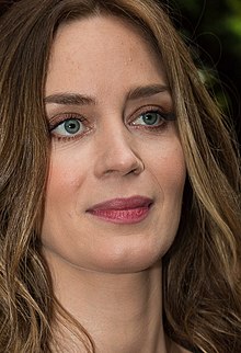
And joining us for Chapter 1 are actresses Bingbing Fan, Constance Wu and Ziyi Zhang.
At first glance, they appear to have very similar natural colouring - but beware! Not all Winters are created equal.
Who can balance a variation of Dark Winter burgundy lipstick?

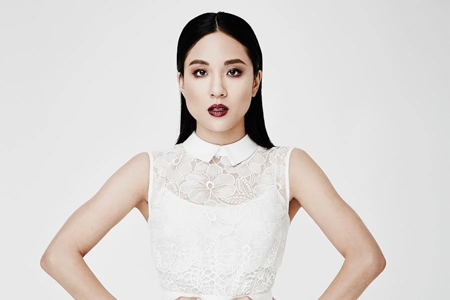
Bingbing’s makeup might be heavily applied but the palette is natural on her face. She’s not disguised - we can still see what she looks like.
Both Constance and Ziyi have a costumy Goth vibe because their natural colouring is clearer and lighter than the makeup. The effect is edgy but not natural.
Compare our three new friends against classic True Winter red.
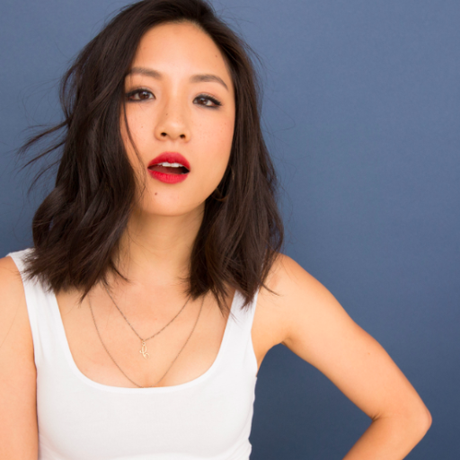
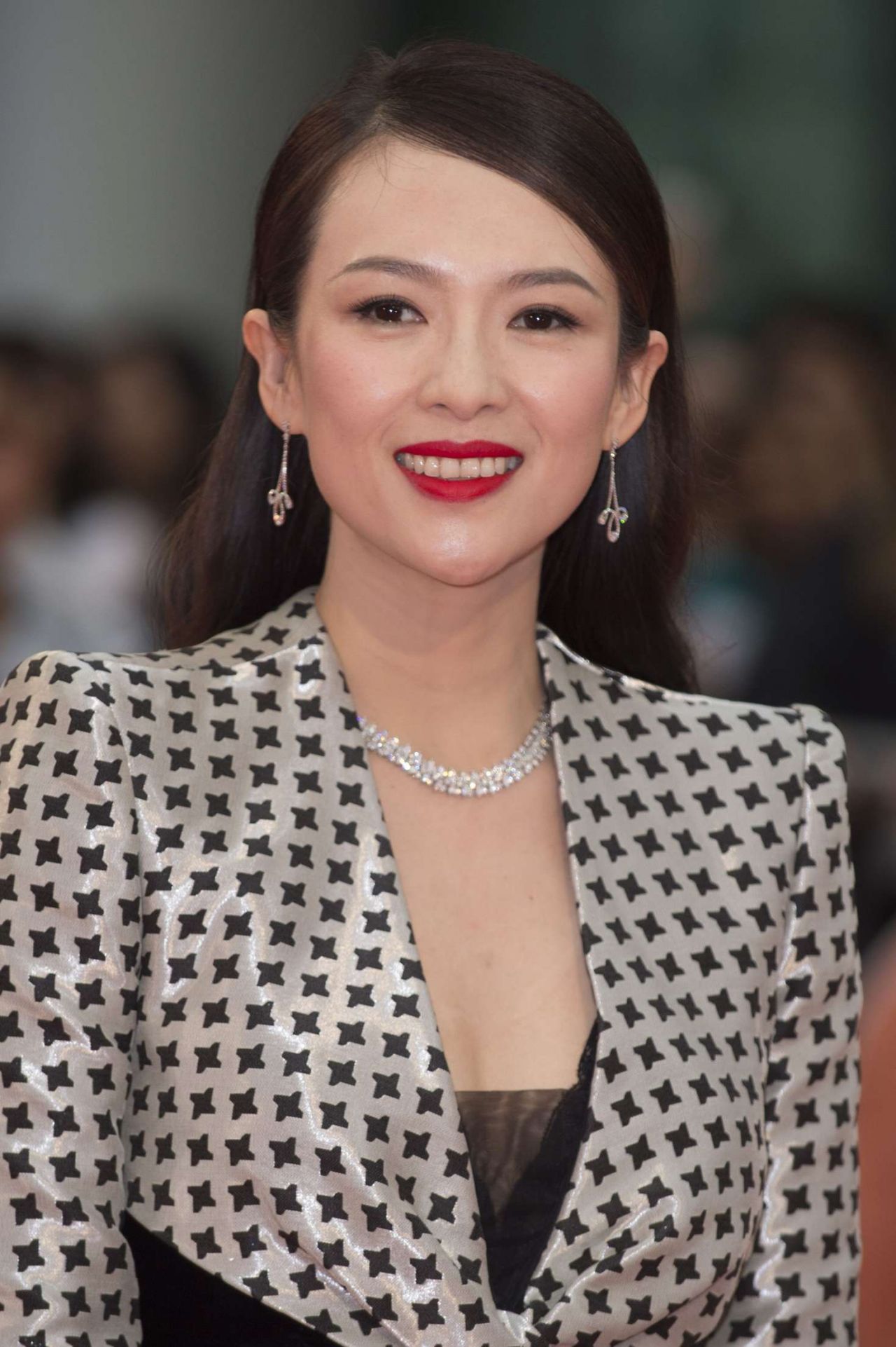
This colour looks really bright on Bingbing but completely normal on Constance.
It’s ok on Ziyi but there’s no magic. She can do better.
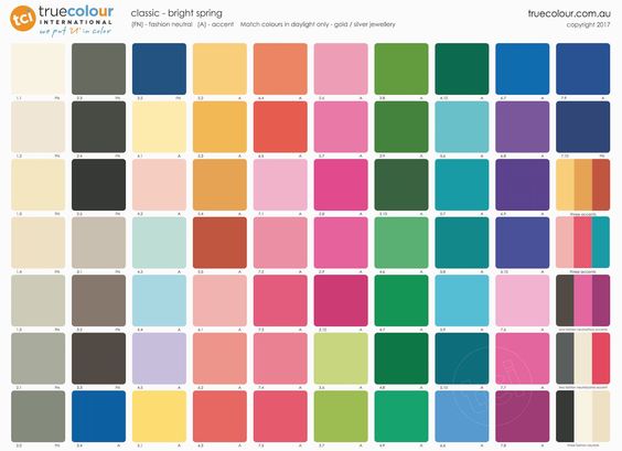
Time to road test Bright Winter.
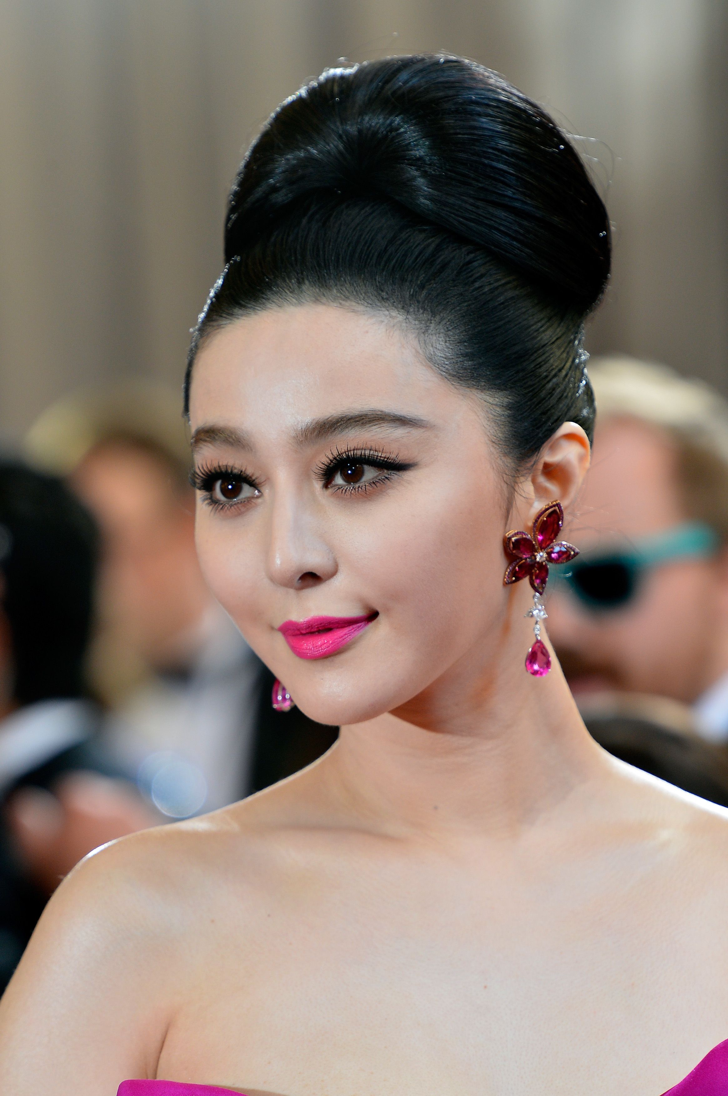
All I see in this picture of Bingbing is painted-on pink lipstick. It might look kind of cool but it’s also super distracting. The colour is a lot brighter than she is.
A similar shade is also brighter than Constance, who looks slightly strange here - although the too-warm eyeshadow isn’t helping. Remember, on purely cool seasons, even a hint of heat will give a muddy effect.
Ziyi however looks radiant. Her face is seen as a whole, with no single feature taking over, and her eyes remain the focal point. That’s a really bright colour yet it isn’t dominating her face. This is colour harmony in action.
Here are Bingbing, Constance and Ziyi in their best palettes, making natural beauty look easy.
Shall we try another season?
Let’s experiment with variations of Spring orange.
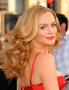
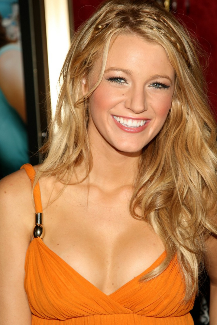
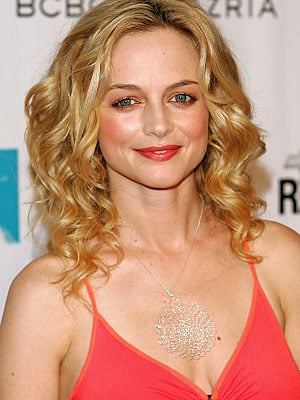
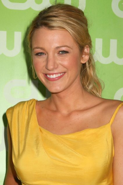
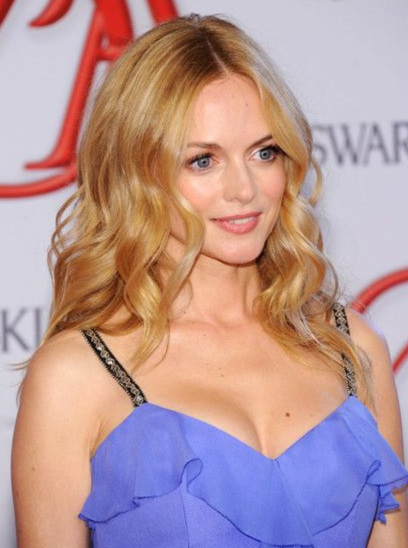
Introducing Scarlett Johansson, Blake Lively and Heather Graham.
Again, these three blonde-haired, blue-eyed actresses might seem fairly similar.
But not all Springs are created equal either.
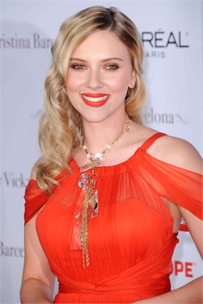
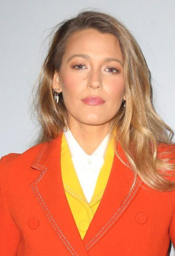
Who looks the most natural in Bright Spring’s super orange?
If you picked Heather, you’d be right. Very saturated, predominately warm colours with a touch of lightness belong to Bright Springs. She looks even-toned, vibrant and fresh.
Blake doesn’t look too bad but the colours are higher in chroma than she is. You notice the outfit before Blake.
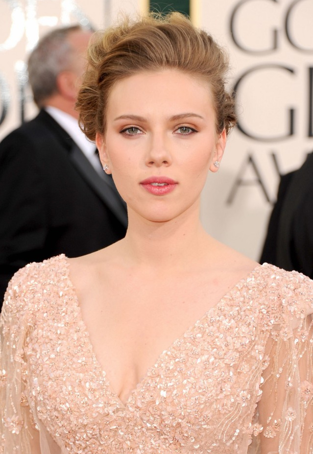
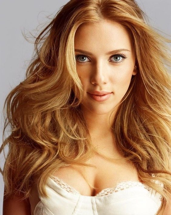
As for Scarlett, she’s almost unrecognisable. With her very delicate natural pigmentation, she looks clownish in this colour.
What if we tone down the chroma levels and find warmer, lighter versions of Spring orange?
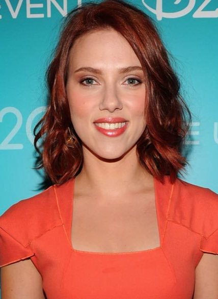
Overlooking Scarlett’s hair, which is clearly not the most harmonious choice, she doesn’t look too bad in this colour. It’s still pretty bright and her makeup is too warm but you can start to see her, unlike when she was buried in the Bright Spring palette.
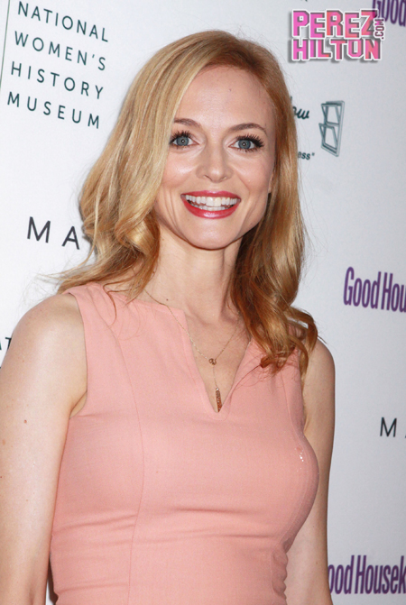
Heather however is starting to look yellowed and jaundiced. The coral dress and the too-warm eyeshadow are draining the clean, punchy energy we saw earlier. Neutral seasons need that warm-cool blend. There is only yellow-based warmth here so we are starting to lose Heather to the heat.
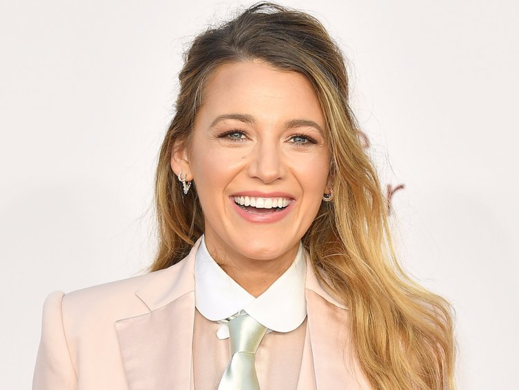
But hey, look at Blake!
Ok her dress is orange not coral - despite copious searching for a picture of her in a version of this colour - but the palette is equivalent. And she looks made from golden sunshine. Not only can True Springs balance all that yellow warmth, they absolutely need it to look their best.
Let’s dress our friends in Light Spring peach.
Neither Blake nor Heather look terrible but they are have become a little pale and washed out. Heather’s hot pink lipstick is helping get her through but Blake’s sun goddess glow is long gone.
In contrast, the weightless elegance of this high value neutral is working wonders for Scarlett, who has life and dimension in her face. This is what good looks like for a Light Spring.
And here is Team Spring sparkling in their best natural colours.
Time to explore the dreamy world of Summer.
First, take a moment to review the three Summer palettes.
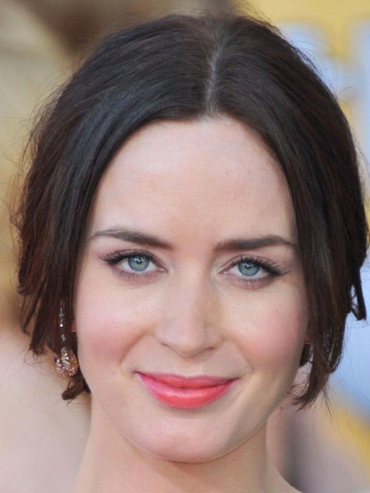
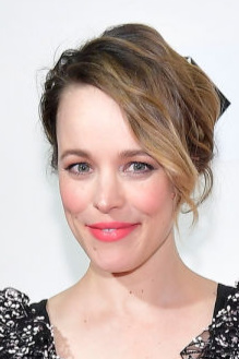
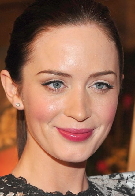
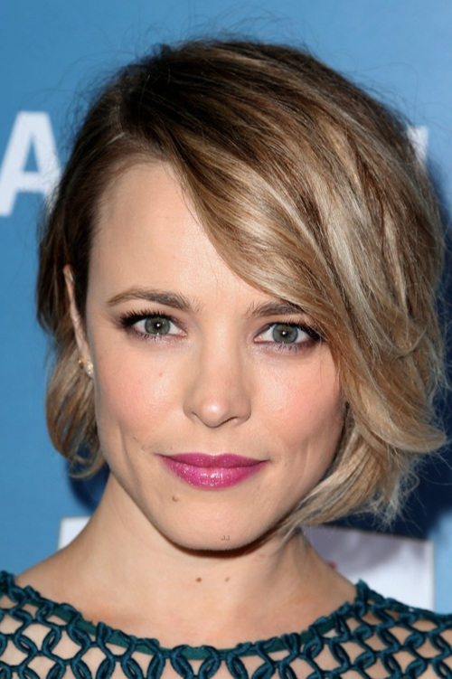
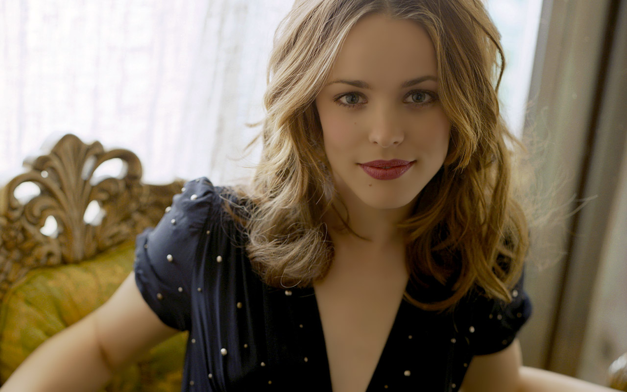
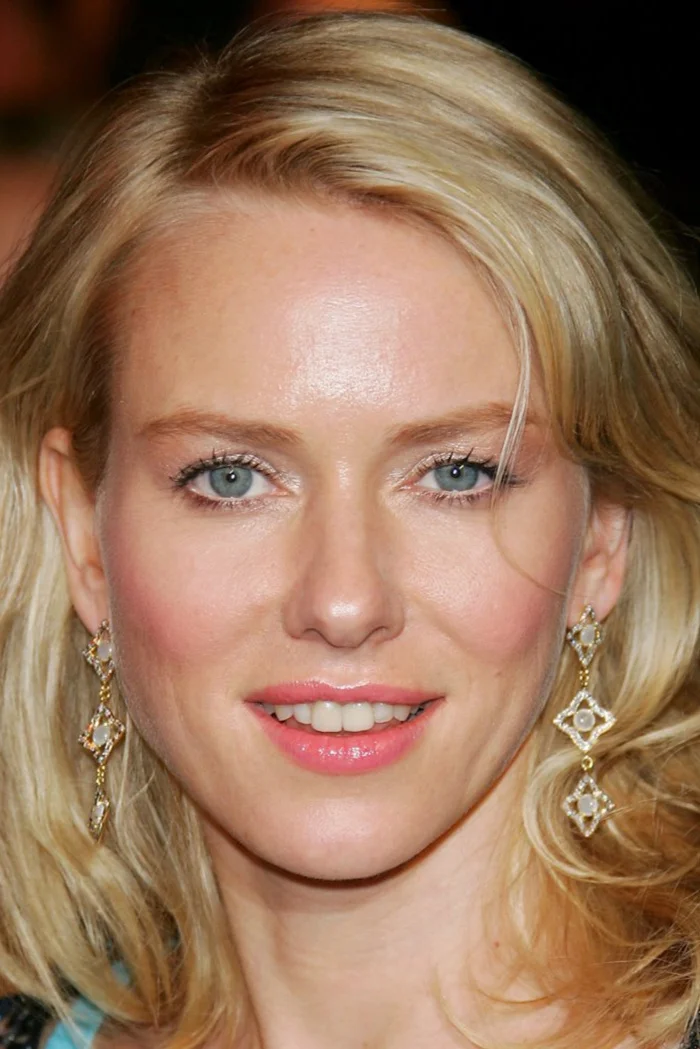
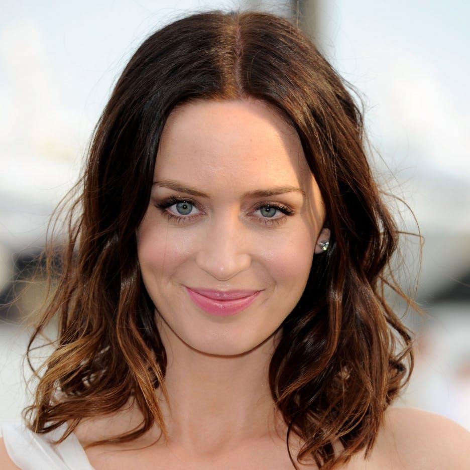
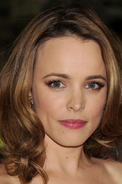
Now meet Naomi Watts, Emily Blunt and Rachel McAdams as they try out different Summer styles.
Who looks best in fresh, peachy-pink lipstick?
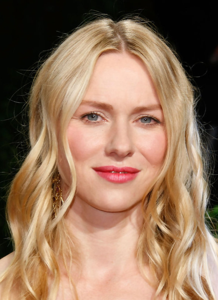
All hail Naomi! She looks healthy and alive with a hint of sunniness. When a colour is working you don’t necessarily notice it. Here her lippie just seems like a normal part of her face.
This colour isn’t terrible on Emily but something is off. The lipstick is brighter and warmer than she is. It’s a little crayon-like.
Rachel’s lipstick is also quite noticeable. The colour isn’t blending with her face and it’s giving her a slightly cartoonish effect. Pretty? Sure. But also distracting.
How about a very cool, blue-based True Summer rose?
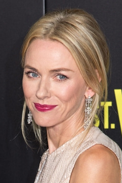
Naomi is warmer, fresher and lighter than this lip colour. It’s ok at a pinch, but it definitely flattens her out youthful energy. We’ve seen her look better.
This colour is so natural on Emily, it’s as if she isn’t even wearing lipstick. She looks finished, polished and elegant. A glowing English rose.
What about Rachel? Her lipstick is a slightly different colour but the palette is equivalent. She looks nice enough but is there magic? Not this time.
How about a variation of Soft Summer’s faded berry-raisin?
This colour is far too rich and dark for Naomi. It’s heavy and ageing. Not her best.
Emily is turning a little muddy and dull. This is a typical outcome of a purely cool season trying on anything with even a hint of warmth.
Rachel on the other hand looks relaxed and natural. She’s got a face full of makeup on yet doesn’t look overdone. For the first time we can now observe how much more depth she has in her natural pigmentation compared with her Summer sisters Naomi and Emily.
And here are three beautiful Summers wearing true-to-season makeup.
All look clean, healthy and alive. Everything belongs.
Onto our last chapter - Autumn.
Behold! Three variations of this season:
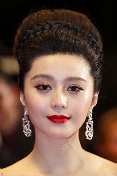
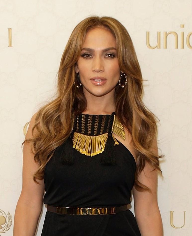
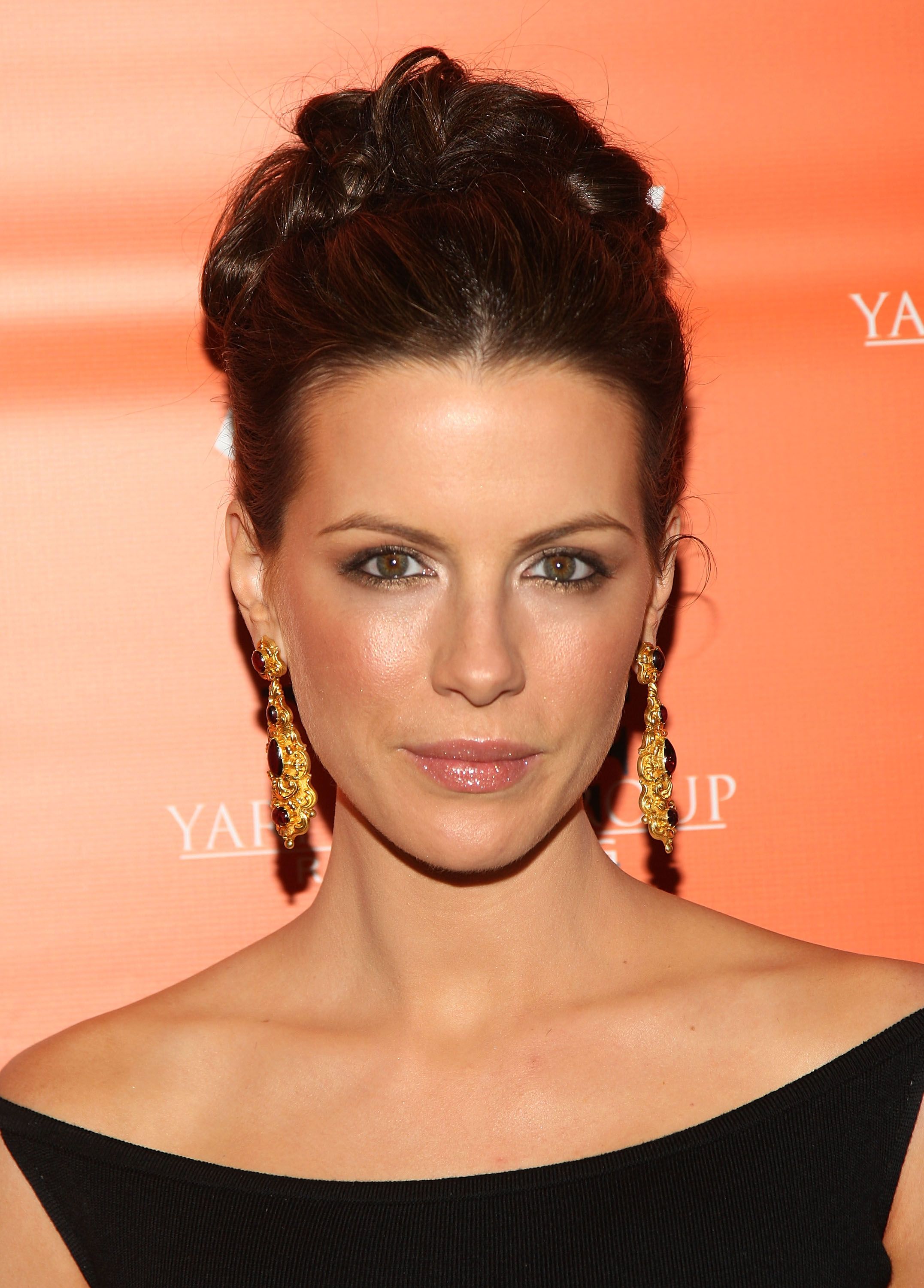
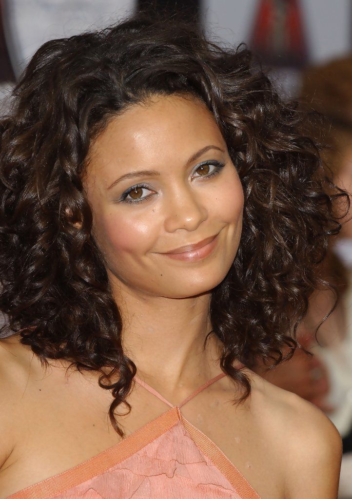
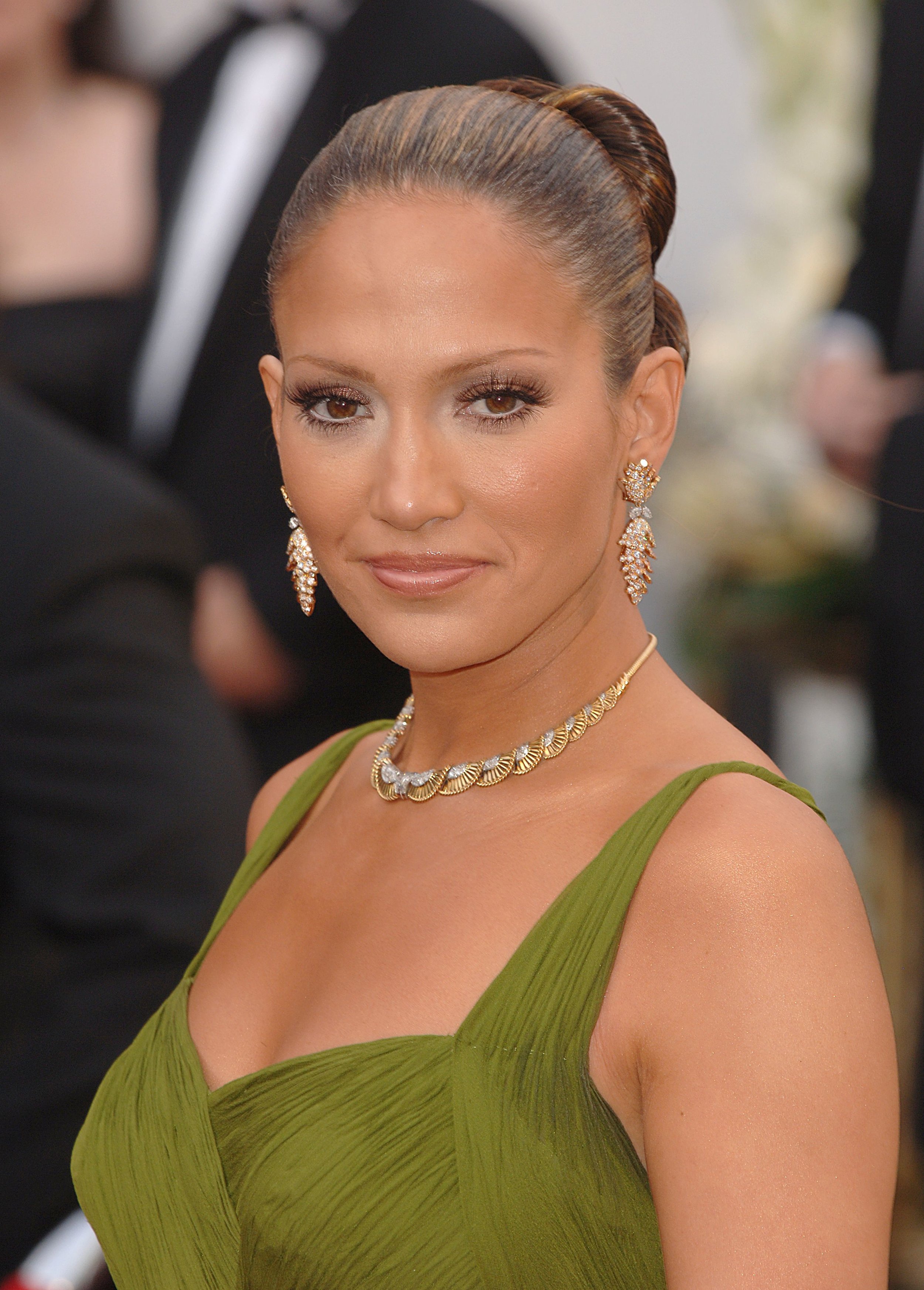
Our Autumn guests are Thandiwe Newton, Jennifer Lopez and Kate Beckinsale.
Soft Autumn has many gentle, earthy, grey-brown neutrals.
But who looks the best in a version of one?
It’s Thandiwe. She is evenly bronzed and softly glowing - that isn’t just good lighting or makeup. The entire look is complimentary, bringing life to what would be a pretty boring colour on someone else.
Jennifer is demonstrating this exact effect. This colour doesn’t look bad, just kind of bland. Great hair and makeup are helping but you can see how much warmer and deeper Jennifer is relative to the dress. The colour seems insipid and is retreating below a face that needs something punchier.
As for Kate, hello beige! This dress is washing her out instead of making her smoulder - the tell-tale sign that colours are working on an Autumn.
Thandiwe wins this round.
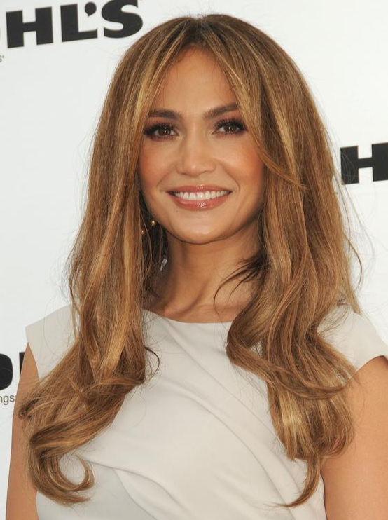
Deep, burnished gold belongs with Autumn.
But who can carry a very warm, medium-dark version?
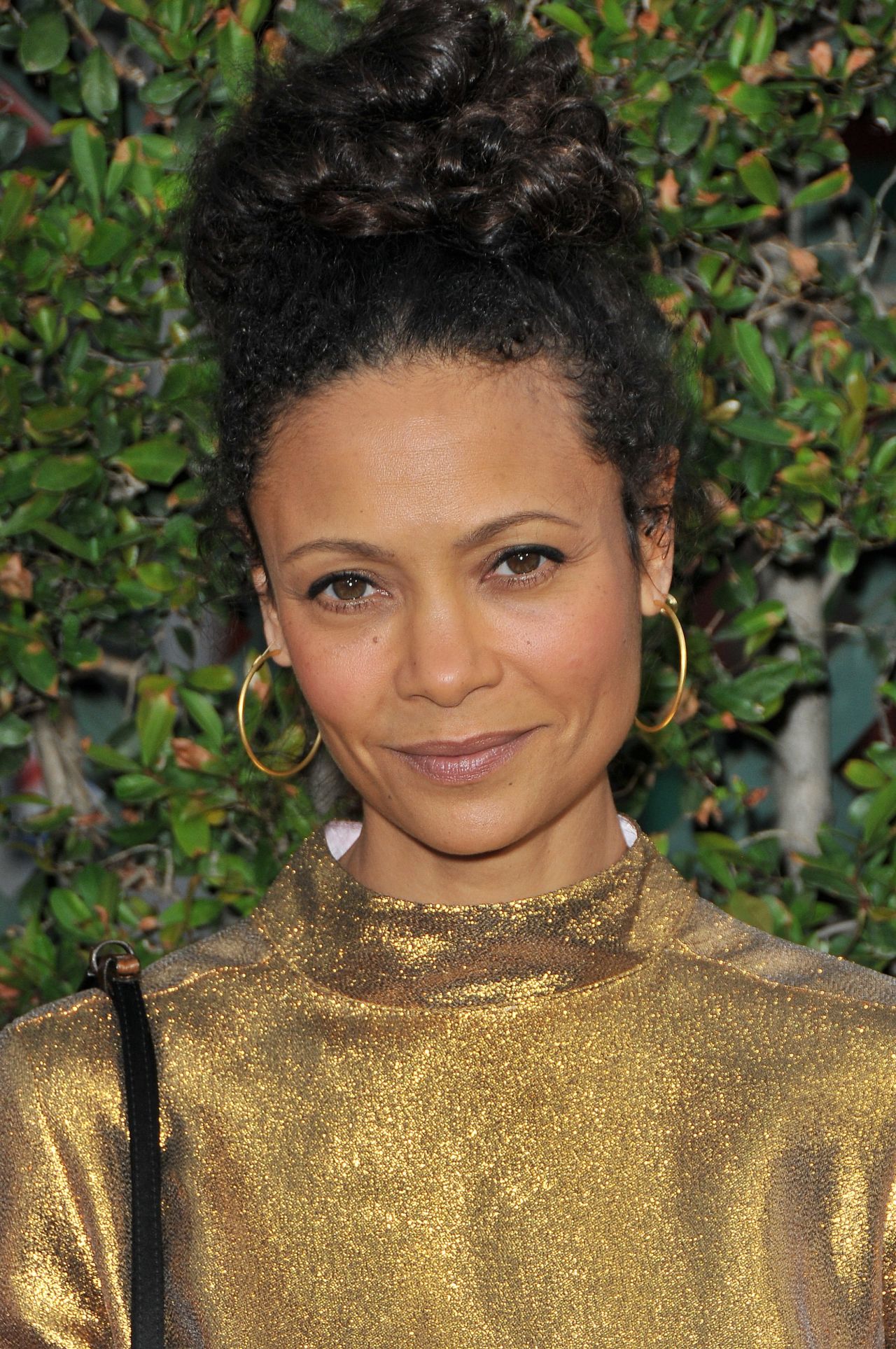
This time it isn’t Thandiwe. That colour is hotter than her so it becomes distracting and overwhelms her beautiful natural softness.
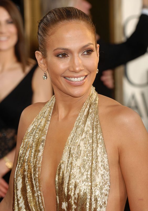
Jennifer on the other hand is a knockout. That’s a hell of a lot of heat to balance yet she’s completely alive drowning in all this burnished gold. She looks made of fire and molten metal. This is True Autumn in all its glory.
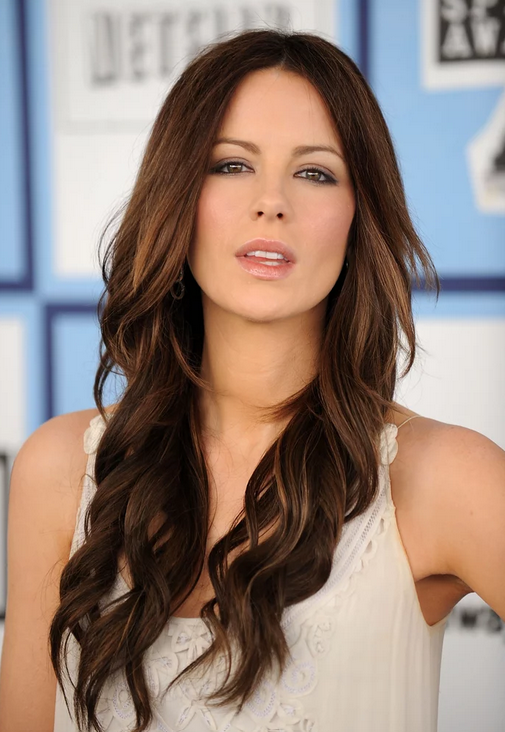
What about Kate? It’s certainly an improvement from the beige and she looks pretty nice, but is she as vibrant and multi-dimensional as Jennifer? Does she look made from fire and metal? Nope.
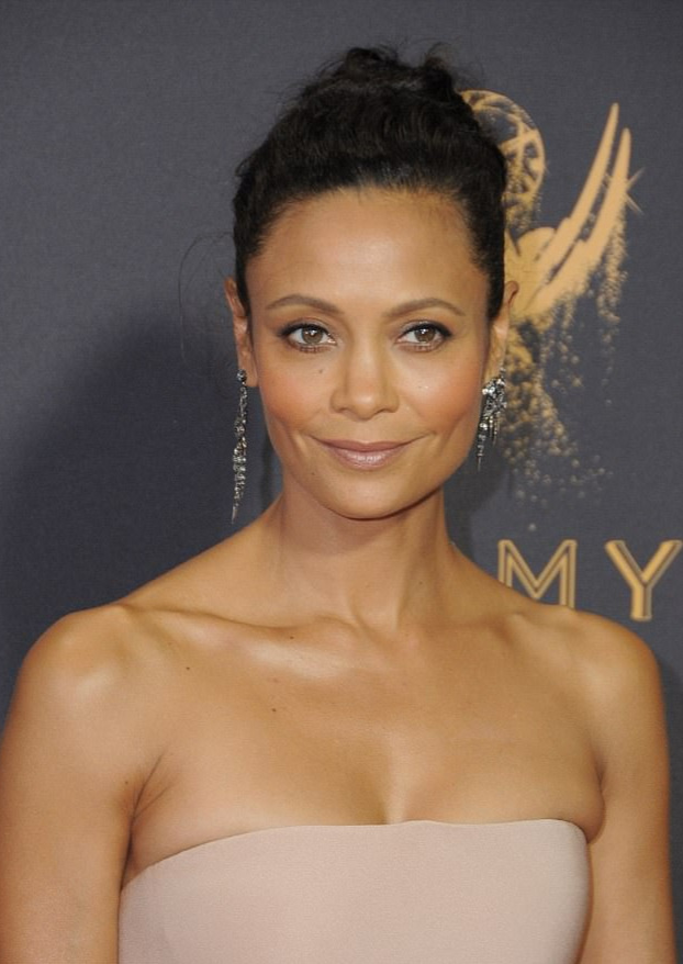
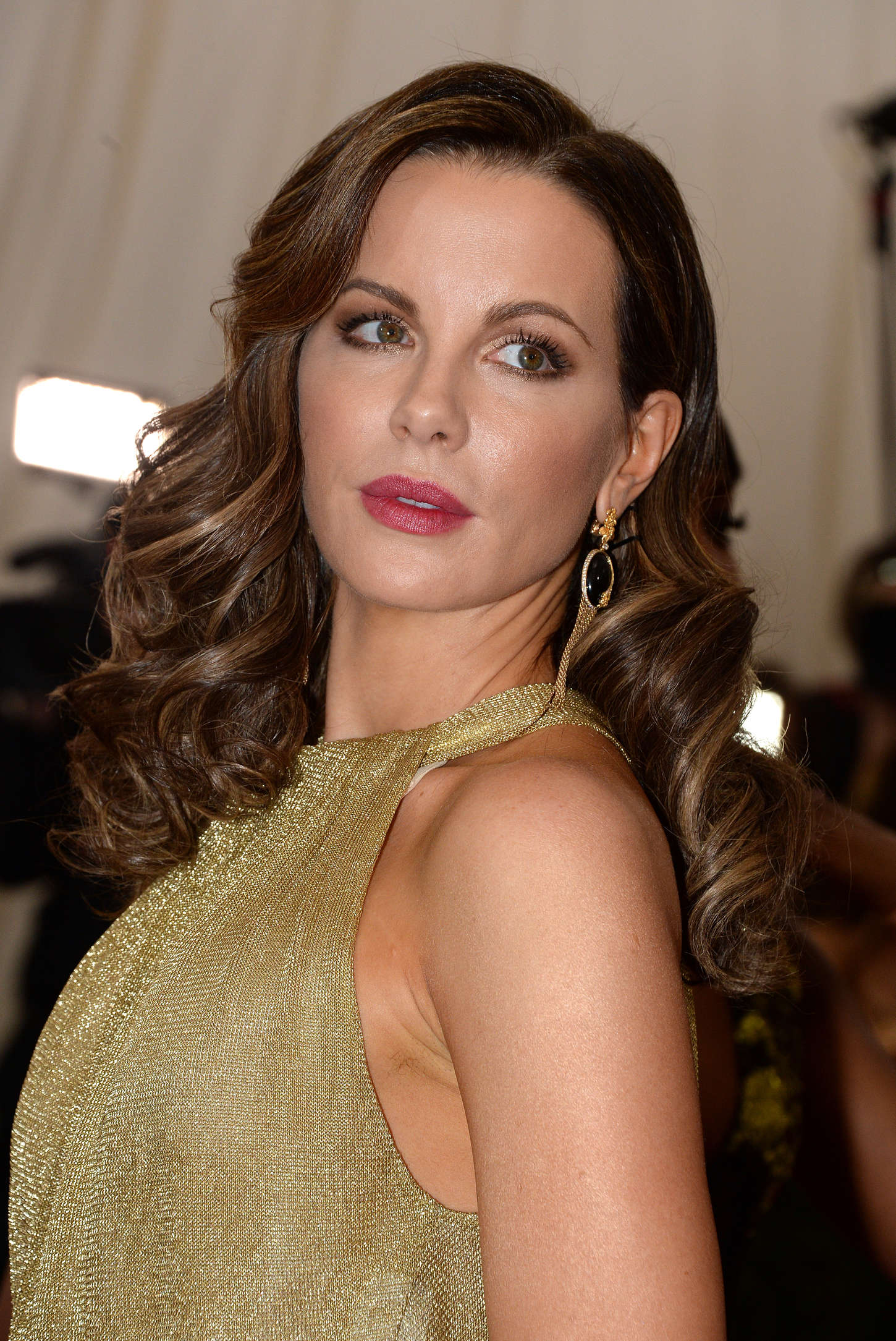
Black features in the Dark Autumn palette but it needs warming up to look its best.
Who looks the most natural and effortless in the combination of black and gold?
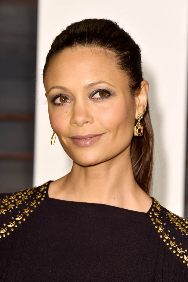
Thandiwe is getting a little Gothy here and she’s actually becoming less recognisable. Compare her with the first picture and you’ll see what I mean. Once colours appear costumy, you lose the person to the styling.
Onto Jennifer. She certainly looks the most dramatic of the three but a lot of that is presentation. Does she look the most natural?
Well, she doesn’t look Goth which means she’s managing black better than Thandiwe. Jennifer’s face and hair seem true to her hue levels but the black looks like it is advancing forwards, diminishing her metallic energy. And her head is a little separate to her body, as if it’s been photoshopped on top of the outfit. Cool styling? Sure. But this isn’t colour harmony.
But finally we can see Kate! Here she is the focal point, you look straight into her eyes. All parts are connecting evenly, with no one particular aspect shouting for attention. This is what happens when someone balances black rather than being swallowed by it.
Here are our Autumn friends looking gorgeous in their respective palettes.
Smoulder x 3.
The three versions of each season might seem very similar but when styled on real people the differences matter a great deal.
Although none of these beautiful women looked unattractive in each other’s colours, they didn’t look as extraordinary as they could in their own best palette.
Taking the time learn our season and how it differs from its neighbours, investing in attention to detail and getting the colours right, has seriously good results.
Effortless, individual beauty.
