
Hue: warm or cool
Hue describes the colour itself – green, blue, yellow etc – but also the level of warmth or coolness contained within that colour.
Almost all colours have warm and cool versions.
Some versions are purely warm (yellow-based) or purely cool (blue-based), while others fall somewhere in between.
How does that work?
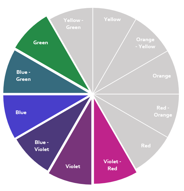
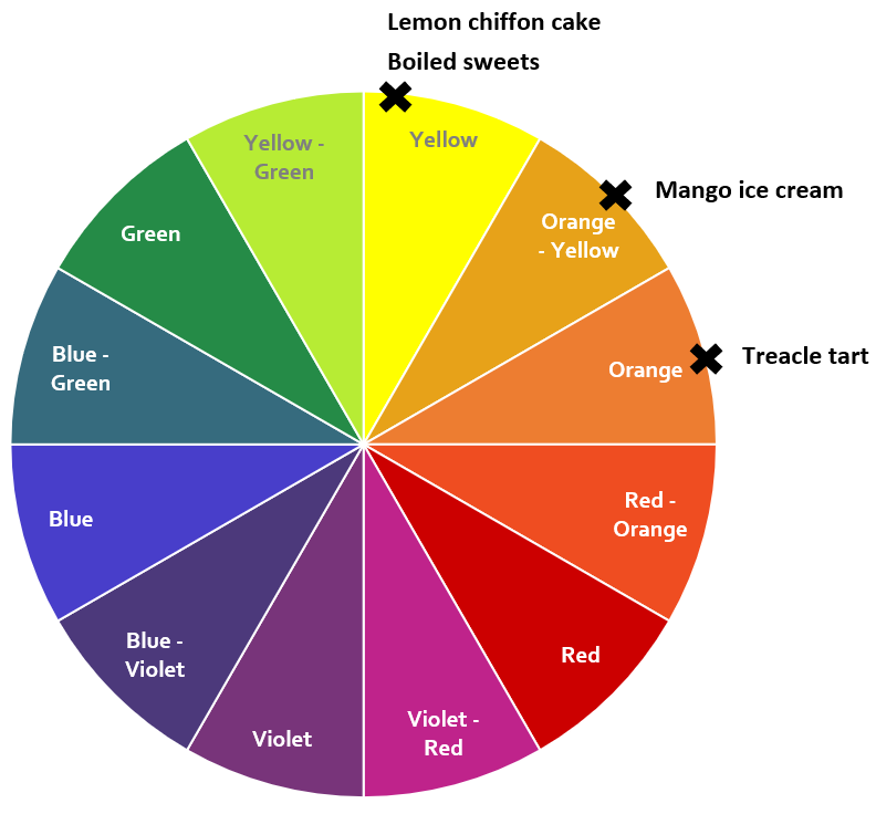
Let’s take a moment to review the colour wheel.

The coolest colours fall within the green-blue-violet section.
The warmest are in the red-orange-yellow section.
Cool colours

Warm colours
Yellow
Let's explore yellow with the help of some sweet treats.
We usually think of yellow as a warm colour.
But compare yellows that fall closer to the orange section with those closer to green:

Warmer versions of yellow are closer to the warmest part of the colour wheel. The colour will continue to cool off as it moves away from peak warmth and closer to the cooler parts of the wheel which begins in the the green section.
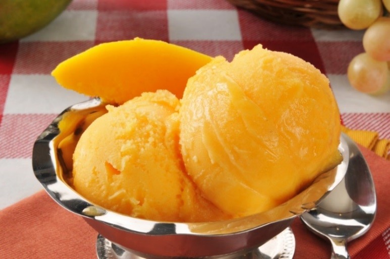
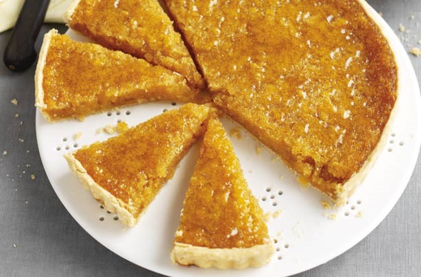
You might call the mango ice cream “orange” and you might call the treacle tart “brown” but there’s still a lot of yellow or golden tones going on. These colours are closer to the warmer part of the colour wheel.
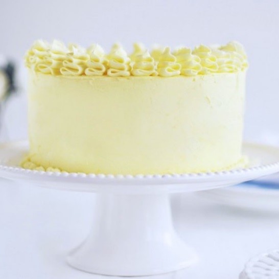
The cloudy pastel yellow of the lemon chiffon cake falls closer to towards green than you'd think.
The colour of the boiled sweets contains lots of white, which has no warmth at all. This acidic, sulphur yellow is like pure white with some very clear pigment added – from a cool part of the yellow section, far from the warmest point.
Still unsure?
Let's isolate and compare these same colours beyond the actual photos.


Would you believe that odd greenish grey actually forms the colour of the lemon chiffon cake?
The ice cream's yellow is really a kind of apricot. Remember your colour mixing from childhood? Orange is red and yellow mixed together. And red and yellow are both warm colours, as opposed to some of these yellows that have a greenish influence.
The next example is another cool yellow. This one is super bright, almost neon. Pure white + pure yellow pigment. I can detect a greenish tinge in there as well.
Finally, the treacle tart's version of golden tones are deep and brown. Lots of yellow-based warmth, moving closer to red.
Red
Let's explore another example with red.
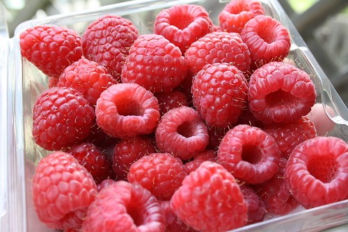

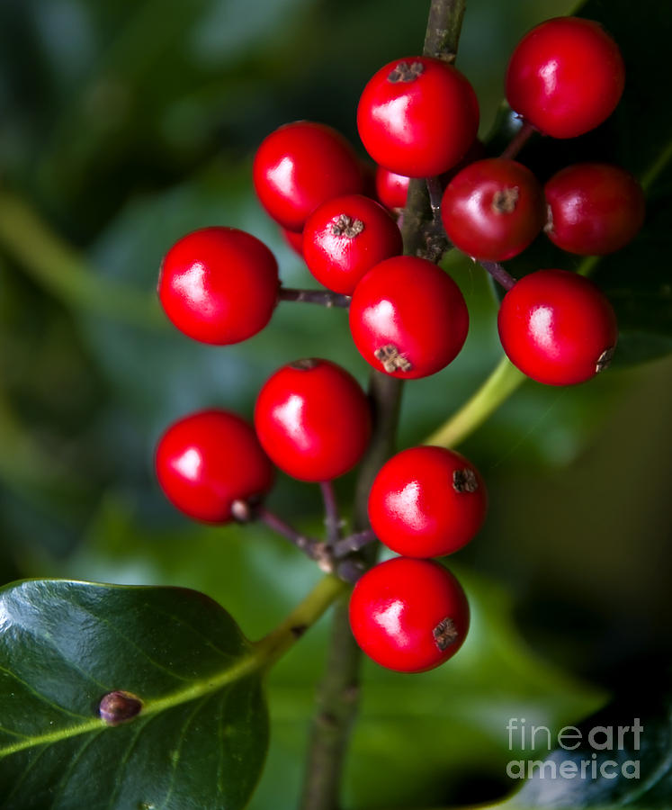

Compare the photographs with the colours lifted from these images below.
The raspberries are cool. Their pink colour is influenced with blue and grey undertones. No yellow in sight and falling closer to the violet rather than orange side of red.
The colour of the tomatoes is very orange once isolated and orange is yellow-based and warm.
These holly berries are a traditional Christmas red - very bright, very jewel-like and very blue-based, towards the violet part of the colour wheel.
The red of Anjou pears contains warm orangey-brown tones. Plenty of yellow, not blue.


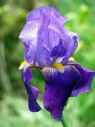
Violet
Let's try a traditionally cool colour: violet - or purple.

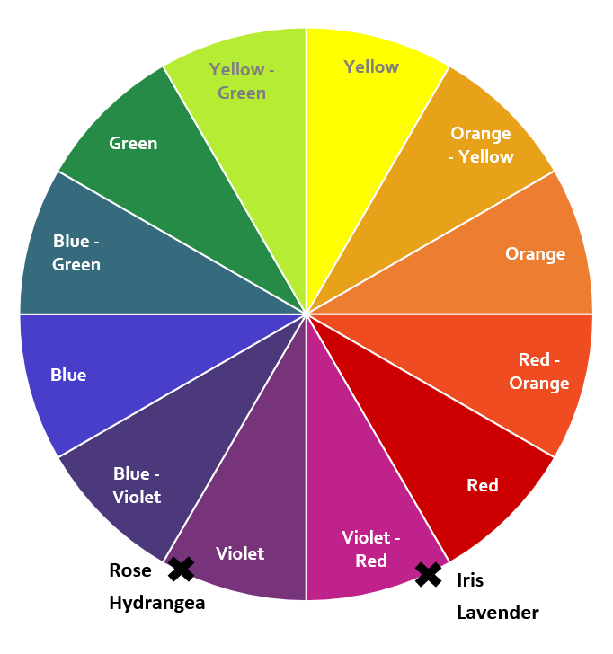
The hydrangea contains a dusty version of blue-grey. There's no yellow here. This colour appears somewhere in the very coolest part of the colour wheel.
The iris is a lively, yellow-based version of purple. It appears closer to the red side of violet, far from the cooler blue section.
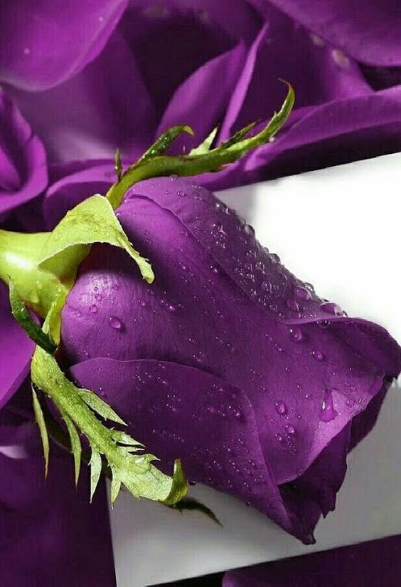
The rose is a bright, very cool Tyrian purple from deep in the blue-violet part of the wheel.
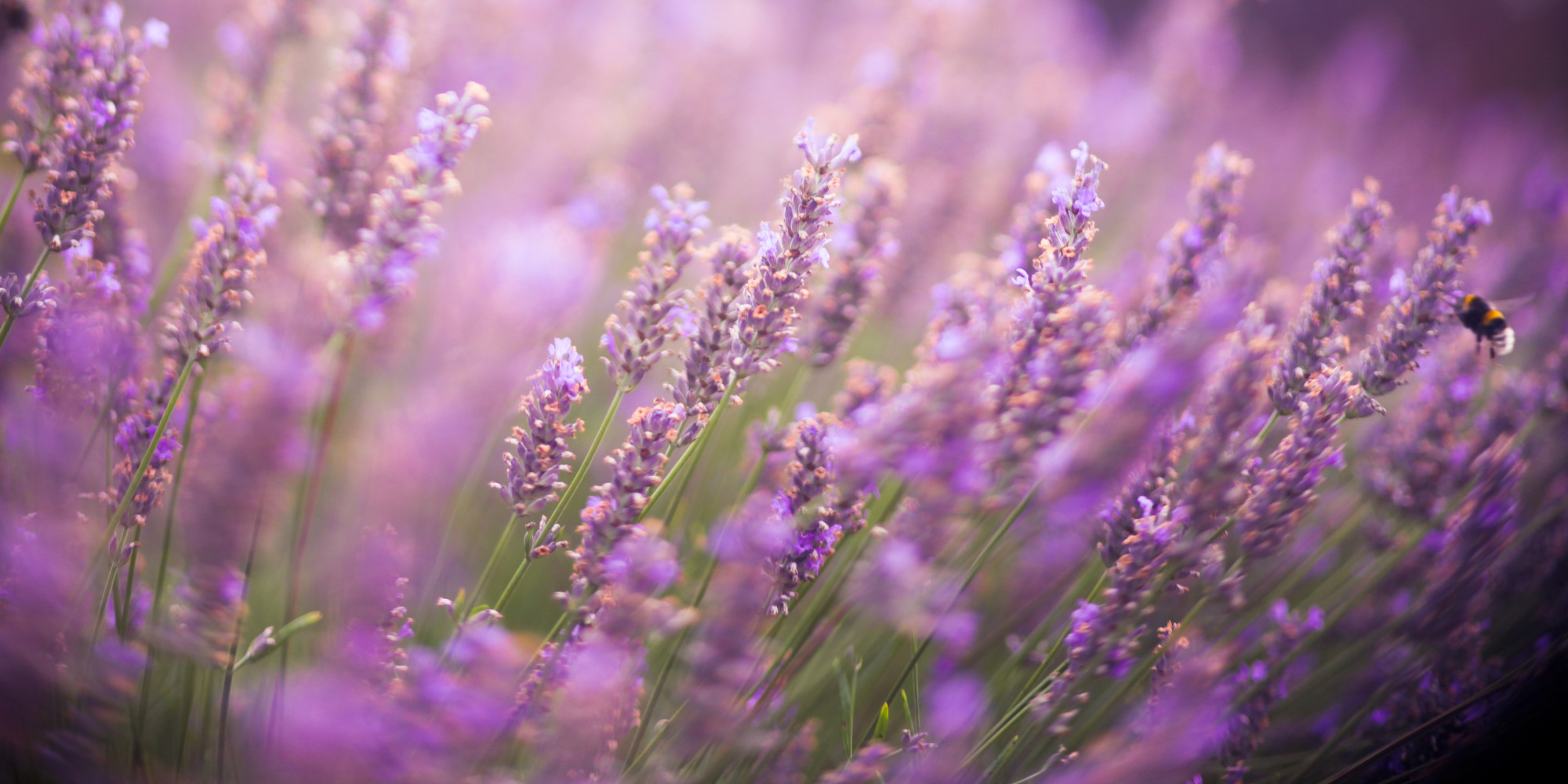
The lavender contains a warm red, going into the violet-red or burgundy part of the wheel.


Hue: neutral
Now we have established that there are warm and cool versions of every colour.
Sometimes a colour is completely warm (100% yellow-based) or completely cool (100% blue-based). We call these true colours.
But some colours - including most of those explored in the above examples - are a mix of both warm/yellow and cool/blue. This is what we call a neutral colour.
When we mix a warm colour with a little bit of cool, we nudge it away from the warmest part of the colour wheel. It might only shift a fraction but that's all it takes to push a colour from true into neutral.
The same is the case for a cool colour when mixed with a little warm.
Consider this gradient transitioning a colour from cool to warm:

To the left we start with a completely cool version of rose pink.
The next colour is that same pink with a tiny amount of yellow-based warmth added.
This effect is repeated until we finish with a completely warm, yellow-based coral in the far right.
Every colour between the first pink and the last coral is a neutral.
You can see the dividing line in the middle of this gradient. Everything on the left is cool-neutral, while everything on the right is warm-neutral.
Here's another example with a different kind of pure cool moving into a different kind of pure warm.

The berry red on the left is purely blue-based and cool.
The rust on the right is purely yellow-based and warm.
Everything between the berry and the dividing line in the middle is cool-neutral.
Everything between the dividing line and the rust is warm-neutral.
So to summarise, some colours are warm, some colours are cool and some are a mix of the two - a neutral.
