

Demystifying True Summer
/Without a doubt, the least common of the Tones is True Summer.
Few of these rare gems walk amongst us.
I believe this is also the most poorly understood group of colours.
Unless you work with colour a lot, I’d venture you don’t immediately recognise many of the colours in this palette.
True Summer catches people out.
Most seasons contain colours that are at least somewhat familiar.
We can usually identify themes and perhaps put a name to several key colours.
In general we understand the concepts of mustard, coral, turquoise or crimson.
But try describing True Summer to someone and watch them struggle to imagine the precise colour space you’re conveying.
Even when they see it, people often do a double take before admiring the palette with a mix of curiosity and wonder.
How can we better understand the elusive world of True Summer?

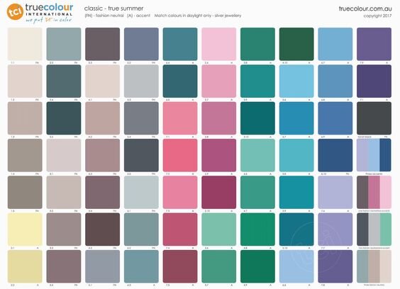
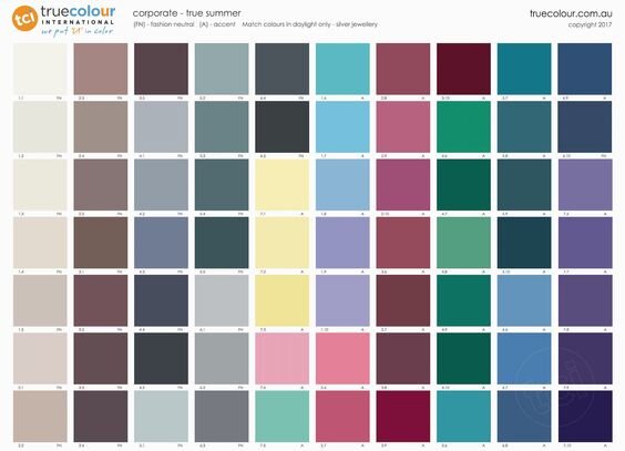
Breaking down the palette
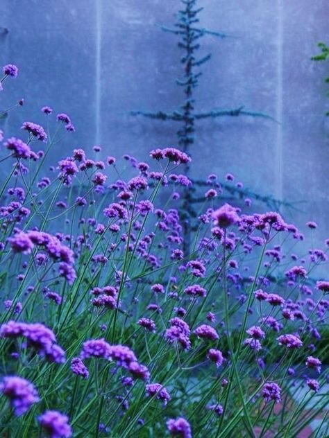
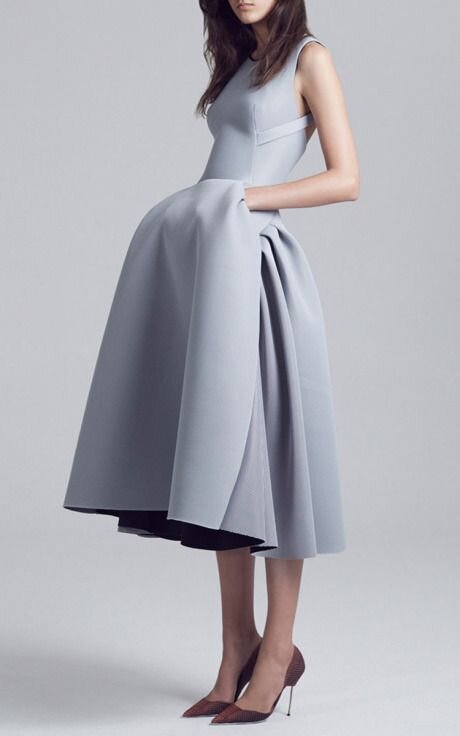
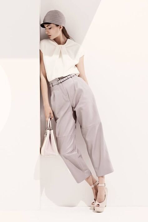
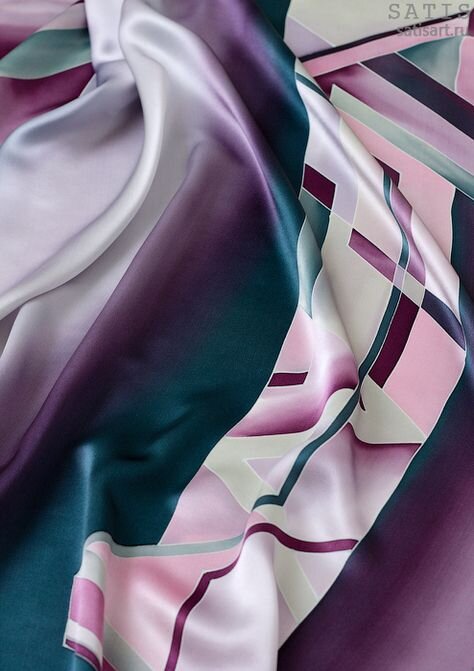
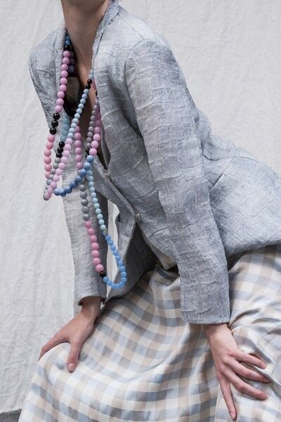
True Summer is 100% cool in hue, light in value and soft in chroma.
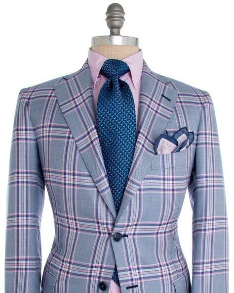
The palette is dominated by grey, blue and pink.
But there are many kinds of grey, blue and pink out there.
Which are True Summer’s?
True Summer seems to be the Tone for which we have the least number of specific colour names.
Or maybe the terms are ambiguous and so susceptible to misunderstanding.
True Summer colours seem to float in and out of each other.
The season’s shapeshifting quality seem like a visual trick.
What exactly are these colours?
The palette is cool but it’s also soft and light - so no black and white.
Replace with dark granite and talcum powder.
There is absolutely zero hint of orange, peach or gold anywhere.
Nor are there any traditional reds.
In many cultures, red and pink are considered different colours.
But they actually exist on the same gradient.
Pink is just light red.
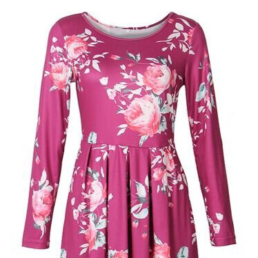
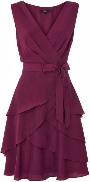
So those deep rose pinks are the season’s version of red.
And that’s exactly how they will read when worn by a True Summer.

Think about how the colours in the palette are constructed.
Grey is in everything.
Ground mineral, basalt, shale or pebble.
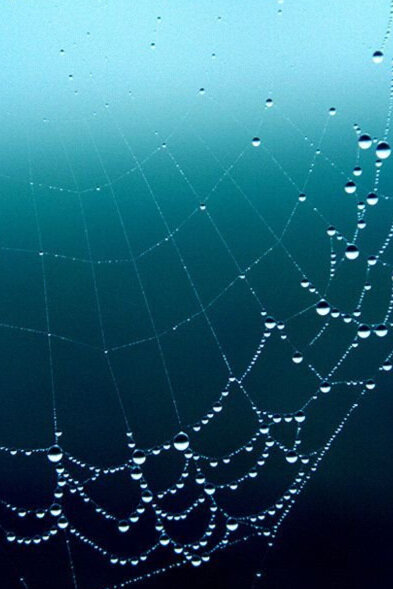
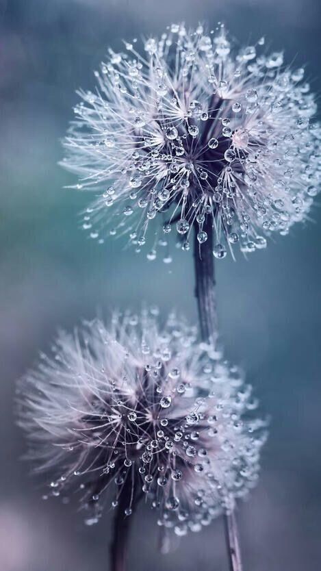
It adds a cloudy pallor over the palette, like you are viewing the colours through fog.
Other key influences are cerulean blue and rose pink.
What happens when you start messing with these basics?
Many of the neutral puces and taupes are blends of grey and pink, like a cloud backlit with coloured light.
Aquatic teals emerge from seagrass green mixed with faded French navy.
Blue and grey combine to create slate or pigeon.
Cool pastel limoncello yellow is softened with dove grey or powdered white.
Lighter lavenders are laced with Wedgwood blue.
All palettes are built from their own colours in this way, influencing each other, containing pieces of each other.
Identifying the key themes can help get your head around the season as a whole.

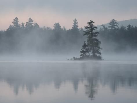
Referencing the natural world
If you’ve been reading my posts for a while you’ll know I love drawing inspiration from the natural world.
Thinking about where colours appear naturally - and under what conditions of light, location and weather - can orient a palette.
As cool, soft and light seasons, what are the natural elements that distinguish Summer?
Air, cloud and water.
What makes True Summer different to its sister seasons?
Light but not a dancing halo.
The uber airy effect belongs to Light Summer.
Cloud but not smoke.
That’s the realm of earthier, heavier and more shaded Soft Summer.
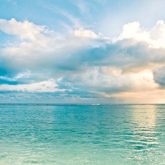
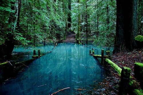
The True Summer palette is liquid water.
Ocean, pond, fountain, lake.
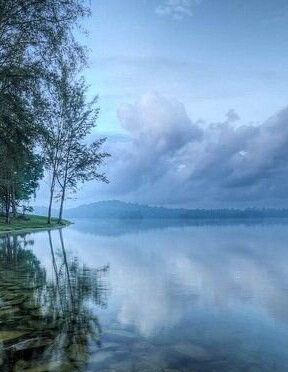
And rain.
Lots and lots of rain.
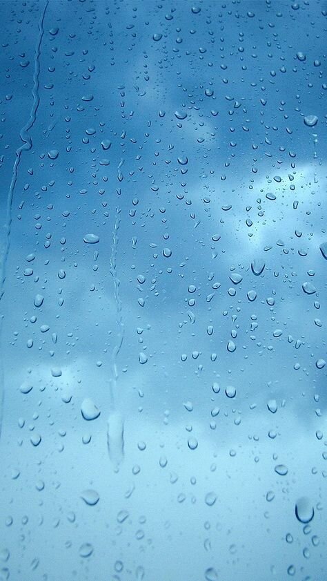
The steady soaking kind, an overcast drizzle.
Beads of water running down the window on a wet afternoon.
The sensation of air pressure dropping and the incoming coolness right before the weather turns.
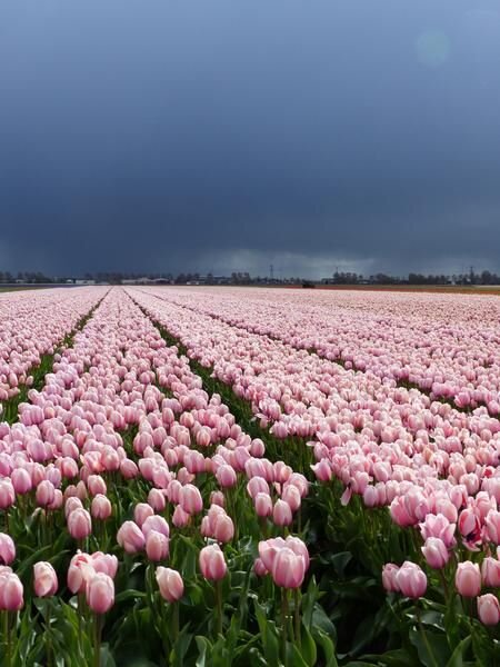
A wall of purple clouds on the horizon.
The drenched garden glistening and dripping, all dust washed away.
The smell of the earth after the deluge.
This is True Summer.
True Summer is a daytime palette.
The sky isn’t clear but there’s still plenty of light, filtered through all those clouds.
It’s atmospheric and moody for sure, but the light is still there.
This means colours can offer the sense of darkness but they only read that way in context.
True Summer is fluid.
Frozen water in all its forms is a Winter quality.
Ice is typically very, very still.
A glacier advances with agonising slowness.
But cloud and water move before our eyes.
This impression is sometimes gentle, like a mermaid’s hair drifting around her head.
Rain and air can be nourishing and calming - a break from the heat, a fresh sea breeze.
But watch out!
All of this can turn with unpredictable dynamism.
True Summer is more than pretty clouds, florals or watercolours.
There is something edgy about purely cool colours.
Whether drawn from Spring or Autumn - the sun or a fire - us humans love comforting warmth.
Although cool spaces can be lovely and calming, most interior design palettes seem to favour cool-neutrals.
Perhaps purely cool spaces need a little extra help to feel inviting.
Yet in that elegant, sophisticated distance lies a special beauty.
How does True Summer’s edge feel?
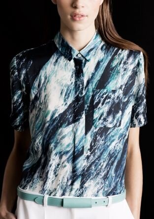
Like cloud, air and water colliding with formidable force.
A sea storm.
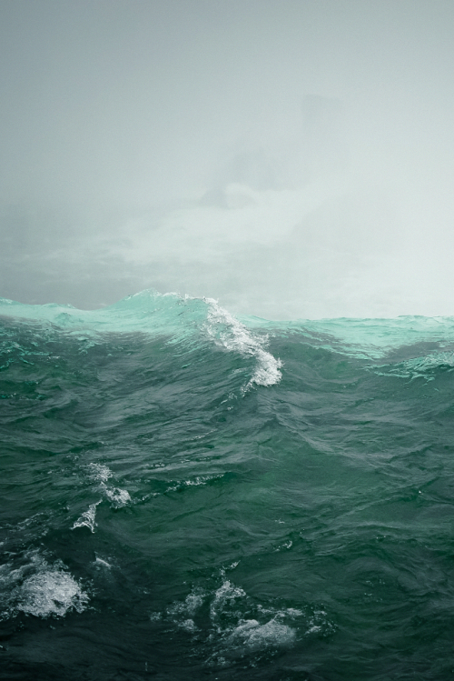
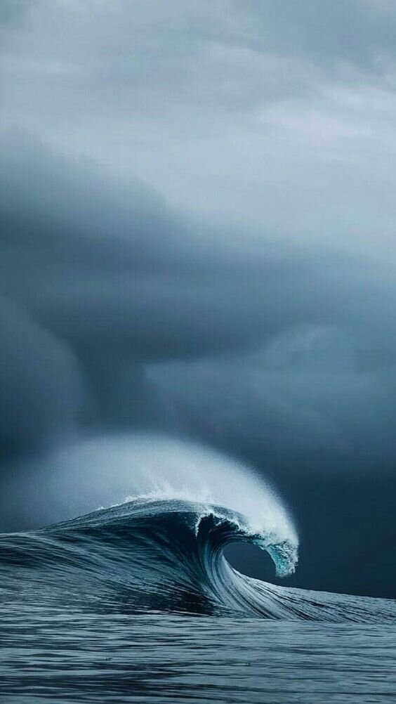
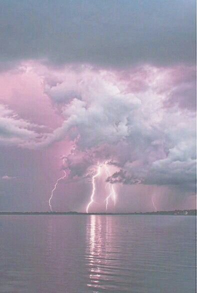
I don’t know about you but I find these images beautiful and unnerving.
The colours are soft but the energy certainly isn’t.
It makes for a fascinating and incongruous combination.
I can almost feel the sea spray on my face, fresh rain washing away the taste of salt.
The calls of contented gulls replaced with the roar of the storm.
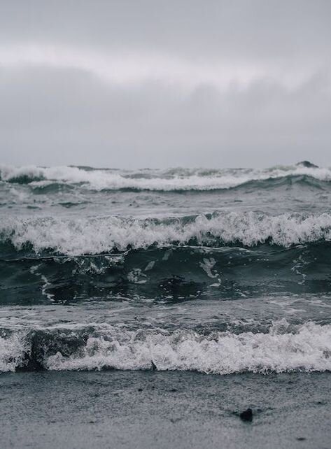
Foaming oceans, crashing waves and daytime lightening are the opposite of calm.
Don’t be fooled by True Summer’s refreshing break from the heat.
This season is also powerfully elemental.
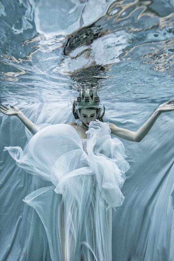
Let’s return to a more benevolent expression of True Summer.
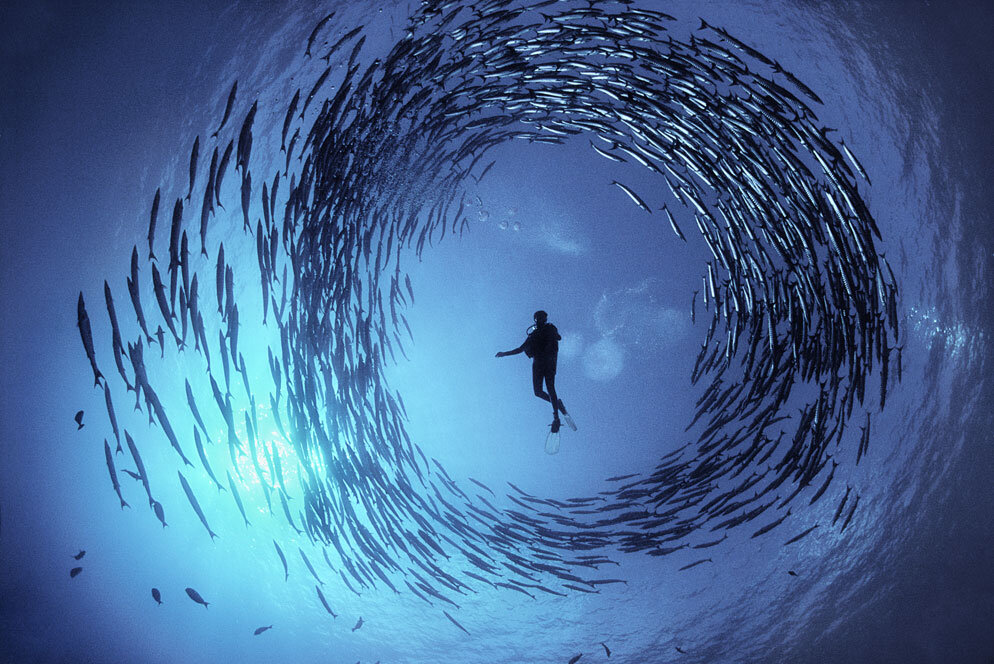
Its strange and magical underwater quality.
Sound is soft and muffled.
There is a sensory caress of cool, moving water slinking over skin.
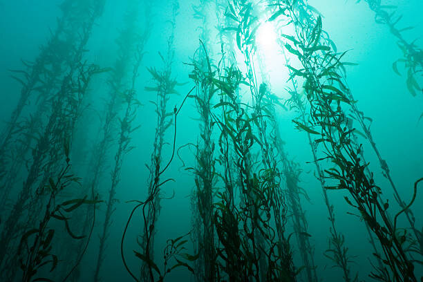
Stones turn greenish or shades of dark pumice grey.
Weeds sway in the current.
Heavy things seem weightless.
Breaking the surface will break the spell.
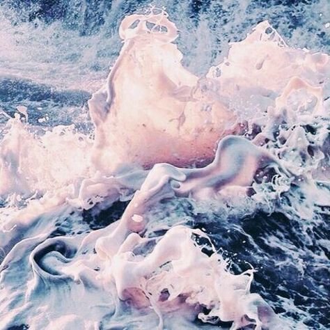
Czech photographer and visual artist Romi Burianova created the following extraordinary images.
These floating, silver-shimmered water nymph vibes are very True Summer.
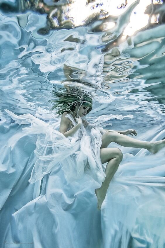
I’ve likened True Summer’s hazy softness to viewing the colours through fog.
But equally you might frame them as being underwater colours.
This water is deeper and less transparent than Light Summer.
You can tell it’s cool just by looking at it, right?
Yellow light cannot permeate as far into water as blue light.
And so we enter a space where blue-based light reigns supreme.
But we aren’t in the dark abyss just yet - we are still working with a high value season after all!
So there is quite a bit of light here it’s just that a lack of yellow turns it silvery.
The result is an eerie, otherworldly beauty.

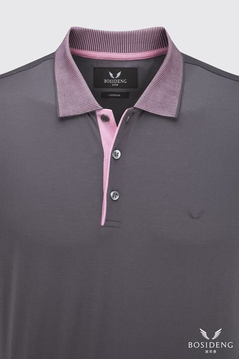
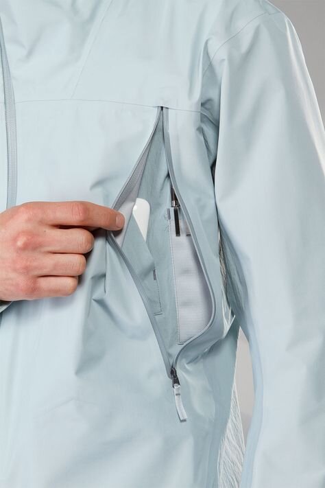
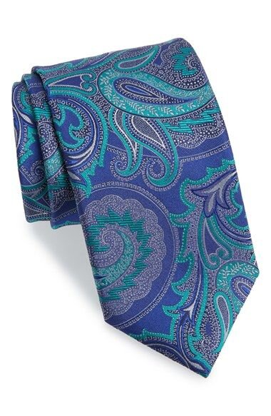
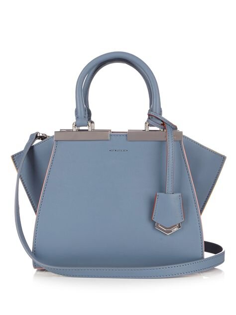
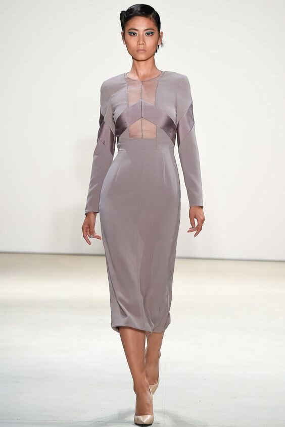
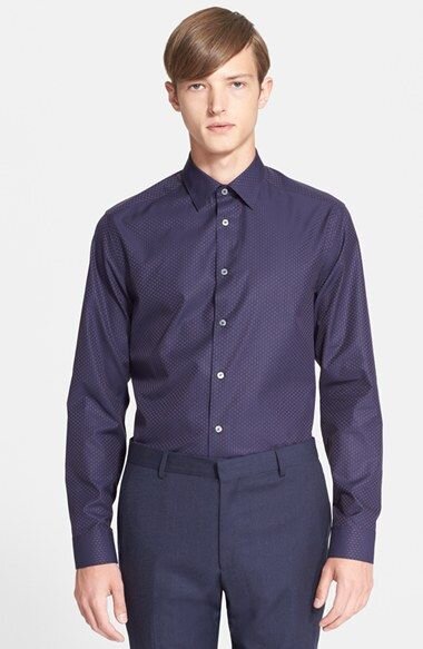
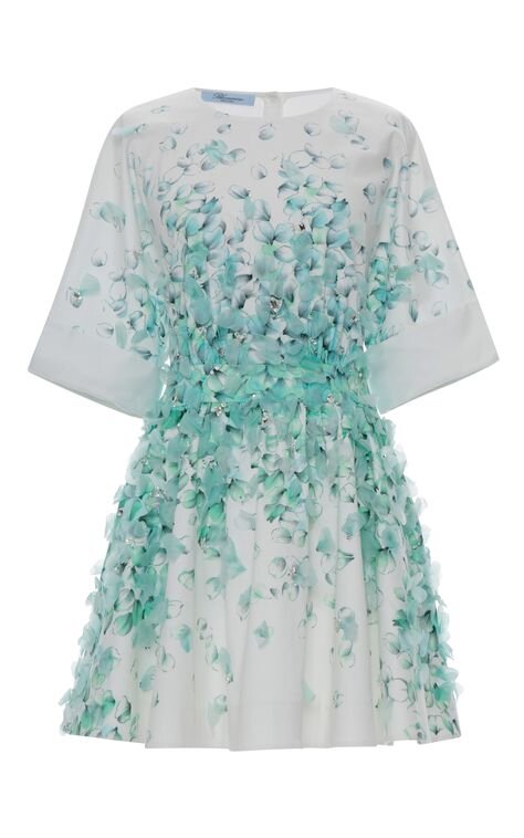
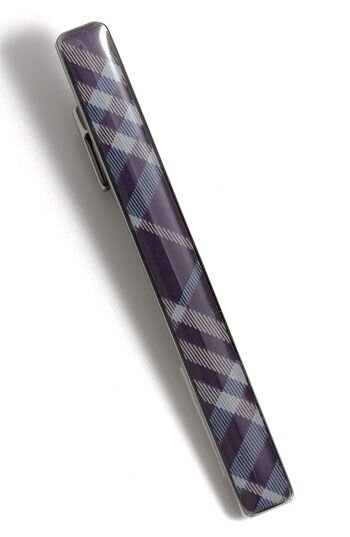
The True Summer wardrobe
Ok so now we’ve had a wild adventure through nature, let’s see how these colours translate into clothing.
The first thing I’d recommend is to remove black and brown from your shopping mindset.
Black will own you.
It will never look great but at least it’s cool.
Brown on the other hand is particularly uncharitable to True Summers.
Even if it’s shoes or a bag or - not joking! - a hair elastic.
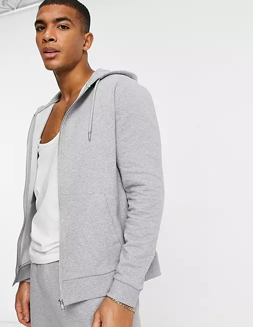
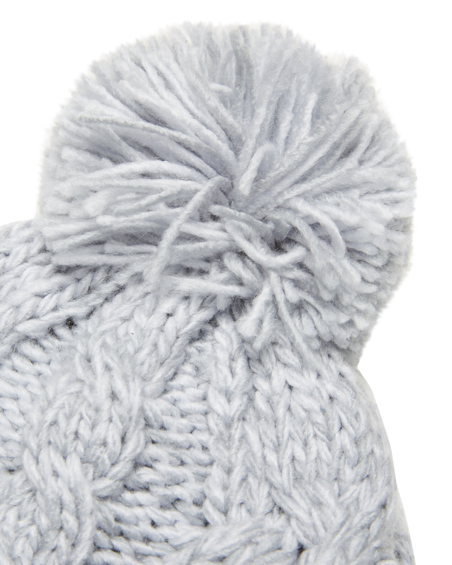
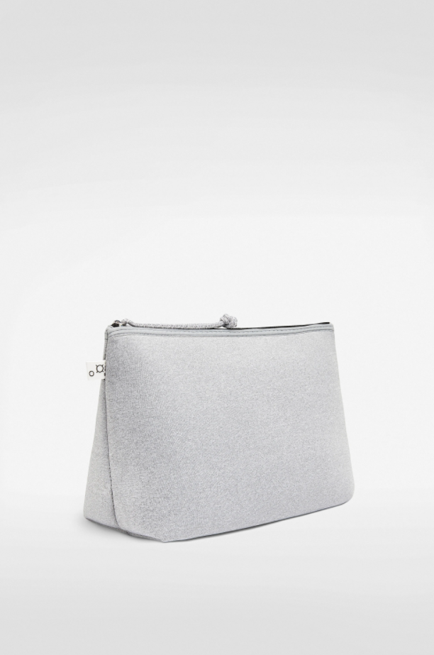
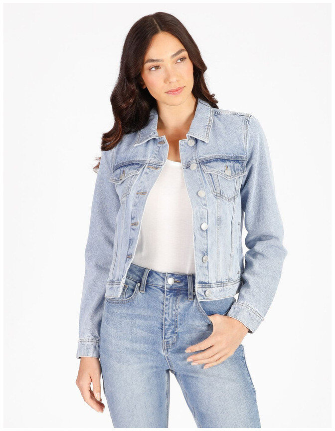
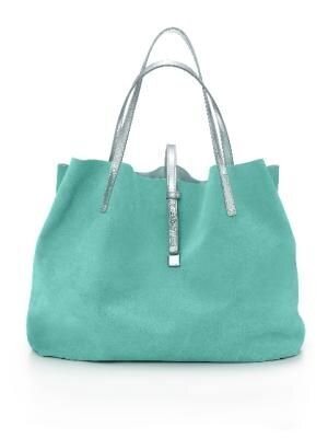
Fortunately there are lots of friendlier neutral whites, greys and blues and luckily they are easy to find.
Soft, cotton ball whites are probably even more available than pure white.
Avoid any that have hints of cream or ivory-linen undertones.
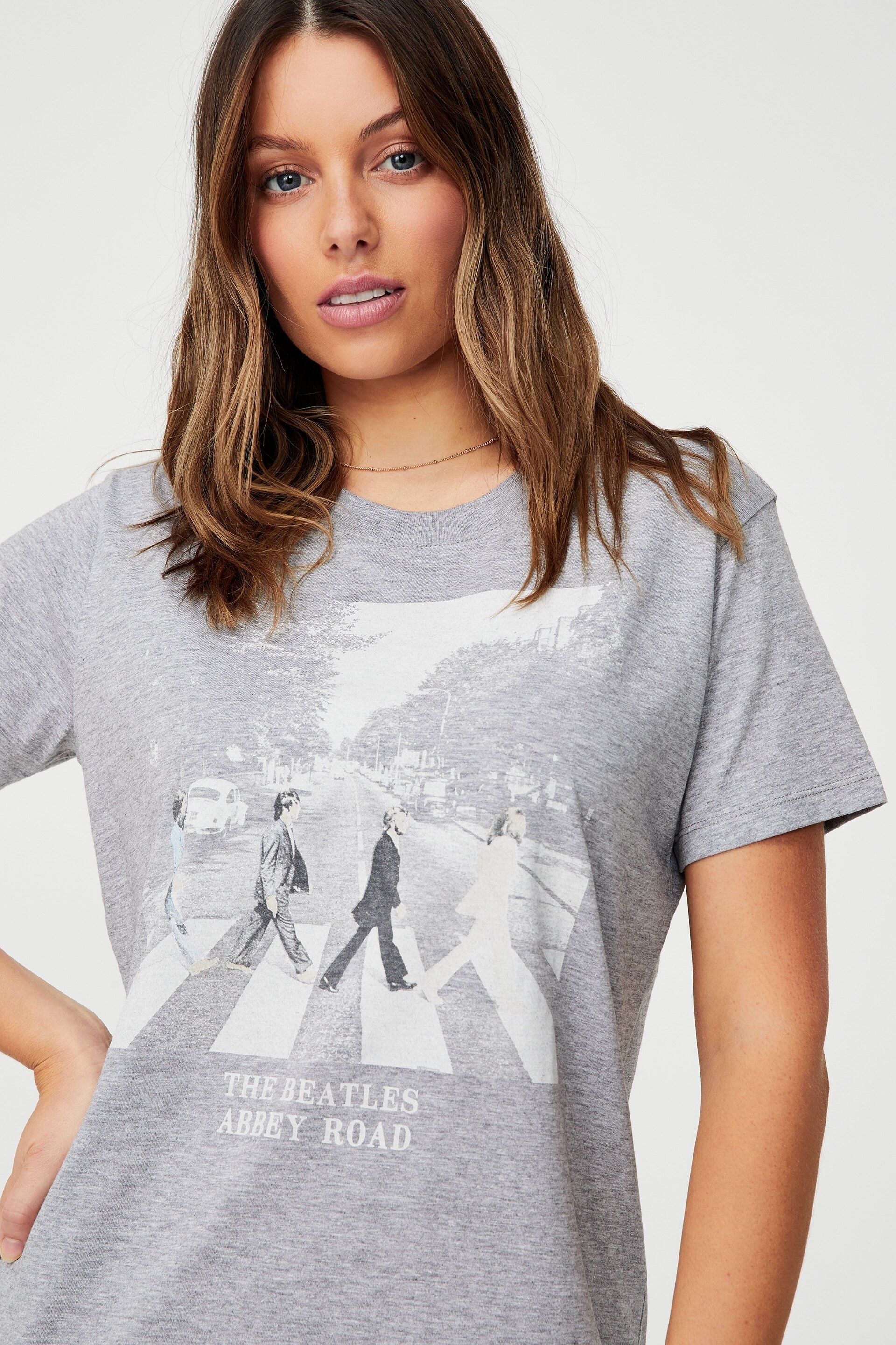
Grey marle is a perennial retail favourite and reliable go-to.
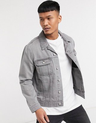
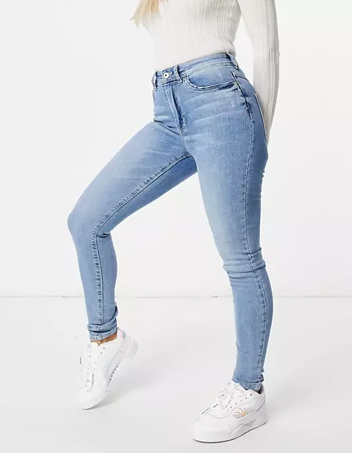
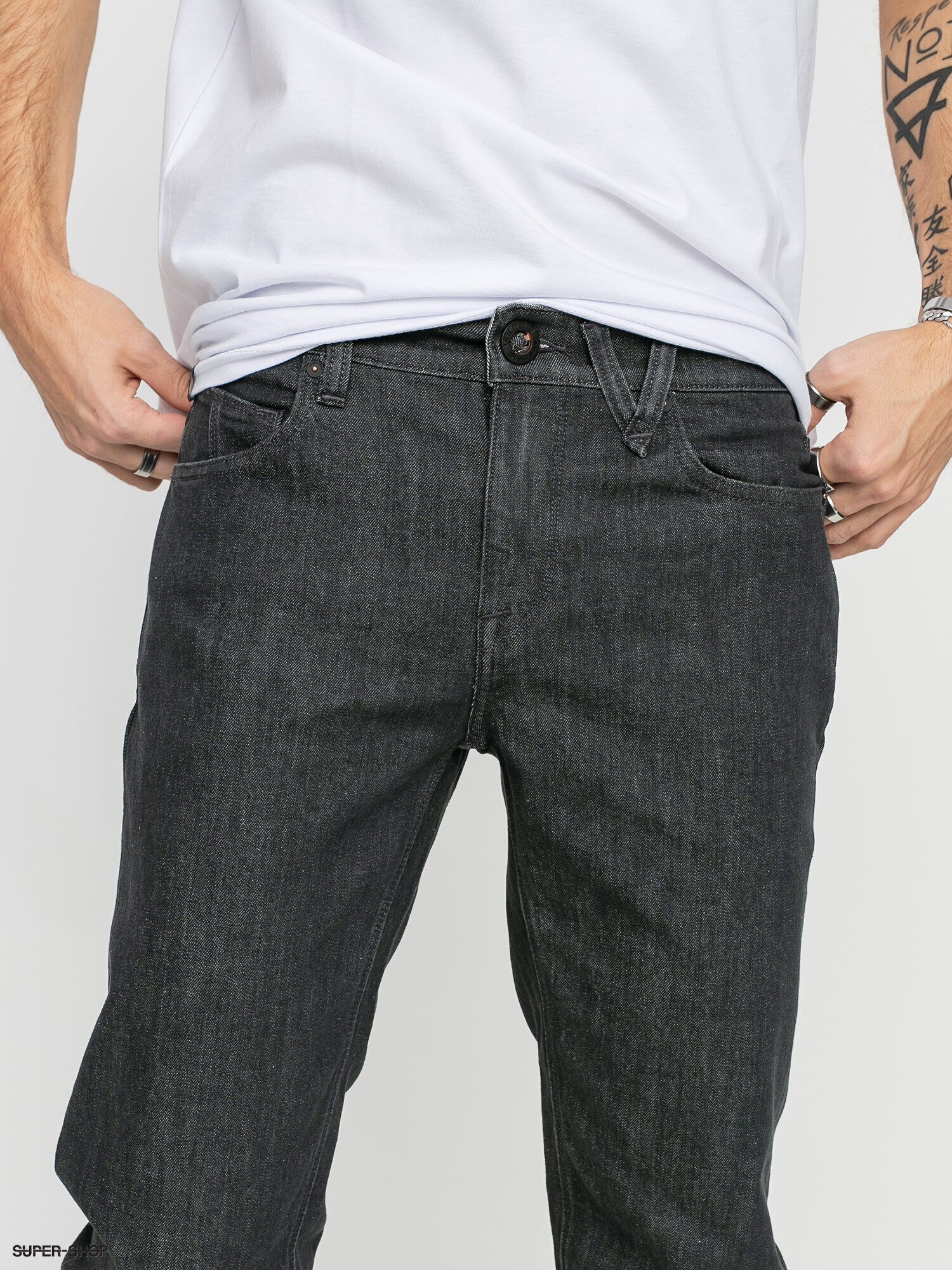
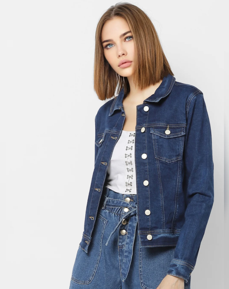
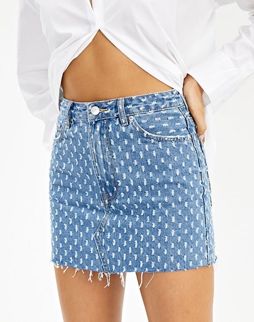
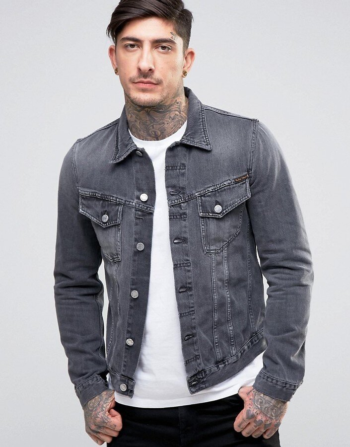
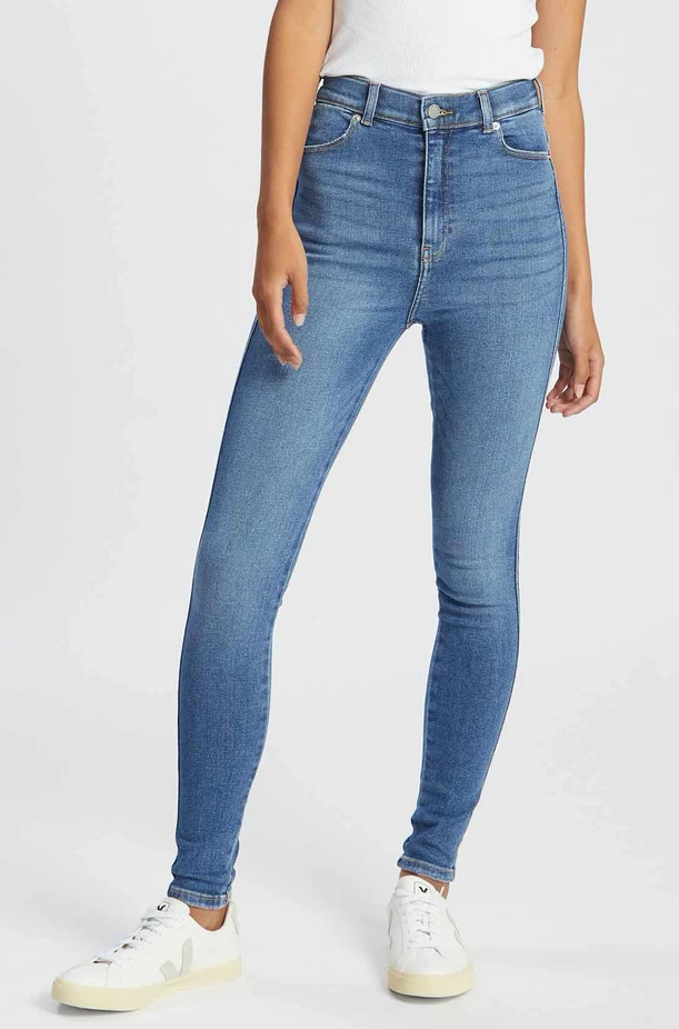
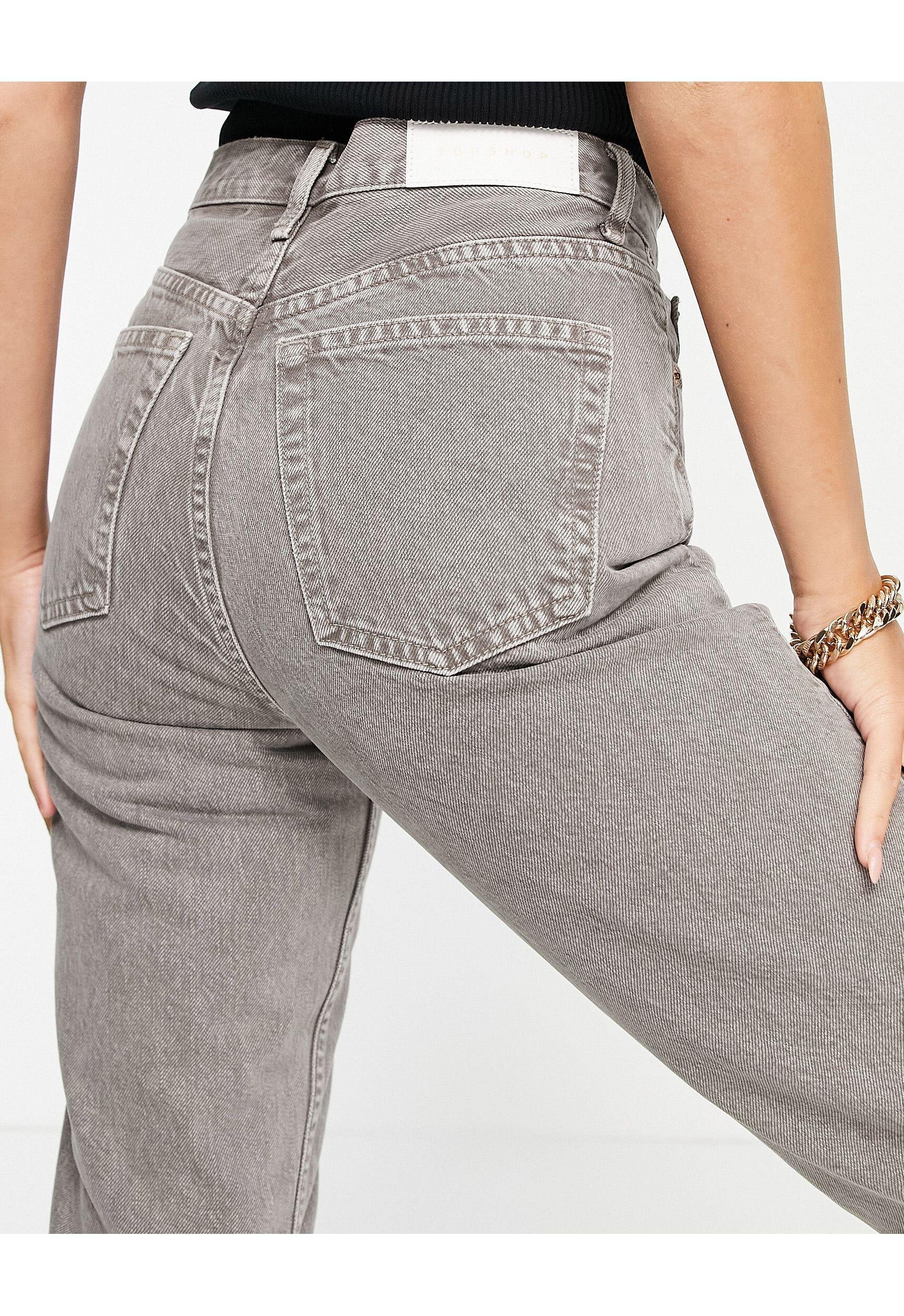
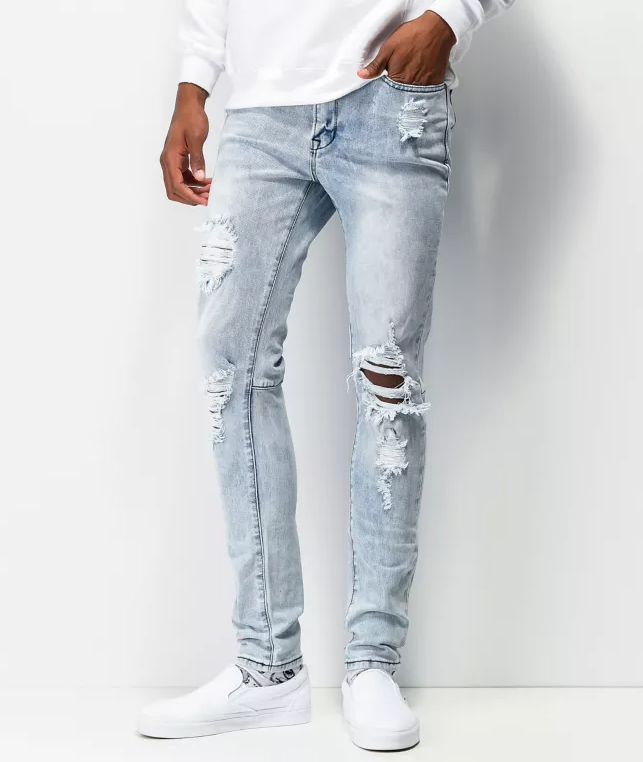
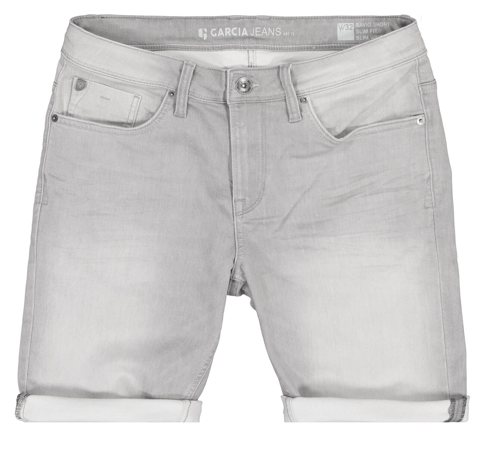
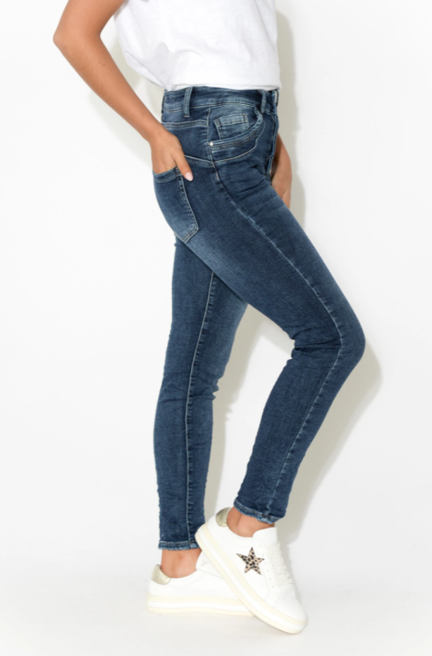
Denim is pretty easy for True Summers.
There is always plenty of grey and blue around.
A bit of wear or fade is great if you like that look.
But the colour should never be dirty or brownish.
Always opt for silver hardware and cool coloured stitching wherever possible.
And be careful not to go too dark.
One thing I find about True Summer is that these colours are unexpected.
As I’ve mentioned, we aren’t very familiar with this palette as a group.
So I find the interaction between colours really interesting.
It doesn’t take much to look original.
Even in basics like jeans and a t-shirt.

So there we have it.
A snapshot of True Summer, perhaps the most mysterious of seasons.
If you’re a True Summer, enjoy being a member of this exclusive club.
Dressing in your season will set you apart from everyone else in an instant.
Dive deep into your feather-soft, water sprite energy.
