

Mailbag: Dark Winter vs Bright Winter
/I had a lovely reader ask me about the difference between Winter seasons.
My reader wondered if a person could be more than one season at a time - in her case both Dark Winter and Bright Winter.
I think this is a really common experience.
Many people wonder if they can stretch across more than one palette.
If black and white are interchangeable across Winters, are there other colours that can do the same?
What if there’s a colour you know doesn’t belong to your palette but repeatedly attracts an avalanche of compliments every time you wear it?
Are we really only ever one Tone and one Tone only?

The short answer is yes.
Everybody falls into one season only.
But there are reasons that colours from other Tones sometimes look ok.
The qualities of colour dimension (hue, chroma and value) are shared between parent seasons.
So it makes sense that colours from sister palettes might be somewhat flattering.
And certainly a LOT more flattering than palettes built out of very different colour dimensions.
Coolness, darkness and brightness are shared across the three Winters.
The degree of each varies between Tonal groupings but these are the most important characteristics for all Winters.
So if a colour contains these dimensions it may very well connect in certain pleasing ways when worn by any Winter.
But only your corresponding season will give truly harmonious results.
You could be a Dark Winter OR a Bright Winter but never both.
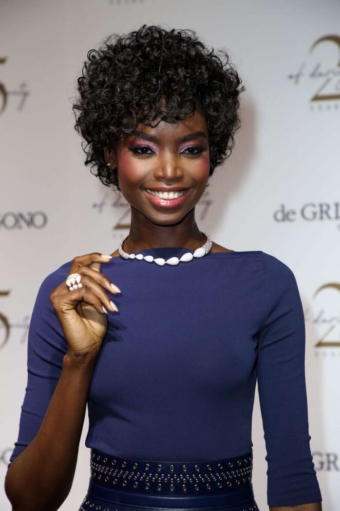
Dark Winter
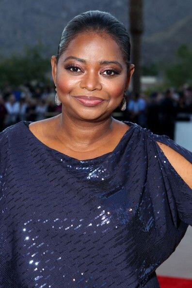
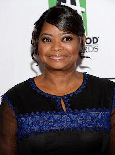
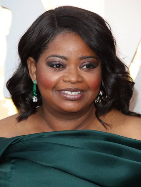
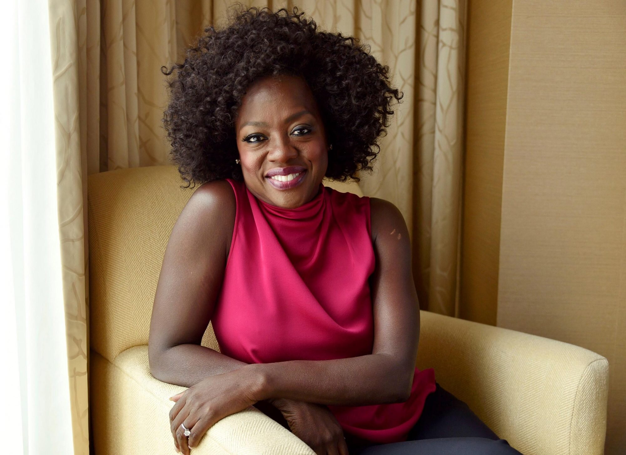
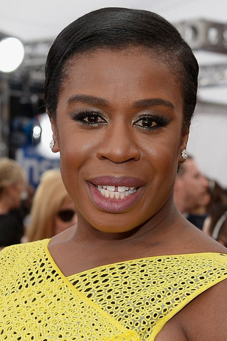
I’m confident Octavia Spencer is a Dark Winter so let’s look to her for guidance.
When Octavia wears her colours, your attention is drawn to her face and specifically her eyes.
Case in point:
There’s no flag waving, attention seeking elements here.
Nothing crowding us in.
Just Octavia.
In fact, it’s like there’s nothing else going on in these pictures.
And that’s not just because Octavia is wearing a subdued neutrals rather than an accent colour.
It’s because she is wearing Dark Winter neutrals.
Neutrals from other seasons wouldn’t give Octavia this all-over balance and rich, even depth.
Bright Winters benefit from a little lift.
Dark Winters don’t.
Incredible!
So much to love.
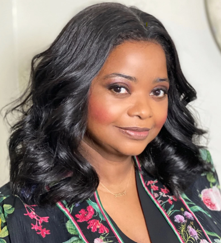
Smoky blackened eyeshadow is particularly arresting on Darks.
And despite the standout accent colour, I cannot look away from this beautiful face.
The yellow frames Octavia but it’s not the main attraction.
She is.
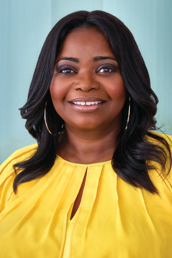
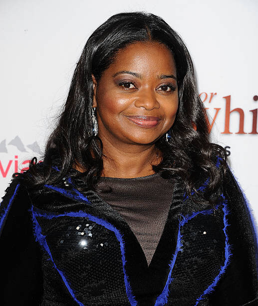
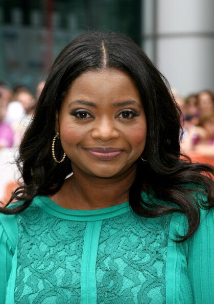
Here’s Octavia trying on Bright Winter:

There’s no disputing this is a knockout colour.
But because Dark Winter is softer than Bright Winter, Octavia’s face plays second fiddle to a wall of Schiaparelli pink.
The pink is louder than Octavia.
She is fading in the presence of too-dominant chroma.
Even though darkness, coolness and brightness are present they aren’t in the right measurements to truly flatter a Dark Winter.
So there’s a certain level of balance here sure, but the outfit still wins against the woman.
Would you compliment Octavia on her styling?
Absolutely and of course.
But you’d be appreciating something other than natural colour harmony.

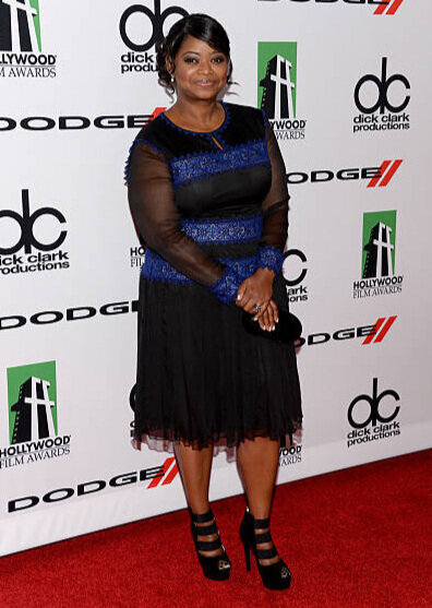
Love the dress, love the drape, love the earrings, love Octavia.
But again, the colour is brighter - and lighter - than the woman.
I notice the blue before anything else and my eyes keep returning to it over and over, like I’m in a colour echo chamber.
Octavia isn’t alone in this picture.
There’s a bright blue dress competing with her.
Compare these two very similar red carpet looks:
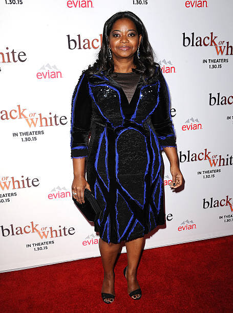
When the chroma of the person is lower (or softer) than the outfit, too-bright colours interfere with our focus.
Even in small proportions.
Even at a distance.
One more example:
(Before we give Octavia a break, she’s been working hard for us!)
Here are the sister Tones of Dark, True and Bright Winter.
Which Octavia isn’t in competition with her outfit?
Which Octavia is totally connected between head and body with the two in easy conversation with each other?
Because of the shared Winter base, enough is working for Octavia to still look great in all three greens.
But only sumptuous Dark Winter is representative of colour harmony.
I actually love that blue-based iceberg teal, it’s a really beautiful colour and one we don’t see very often.
I would certainly comment if I saw it.
But it wouldn’t be natural colour harmony I’d be admiring.
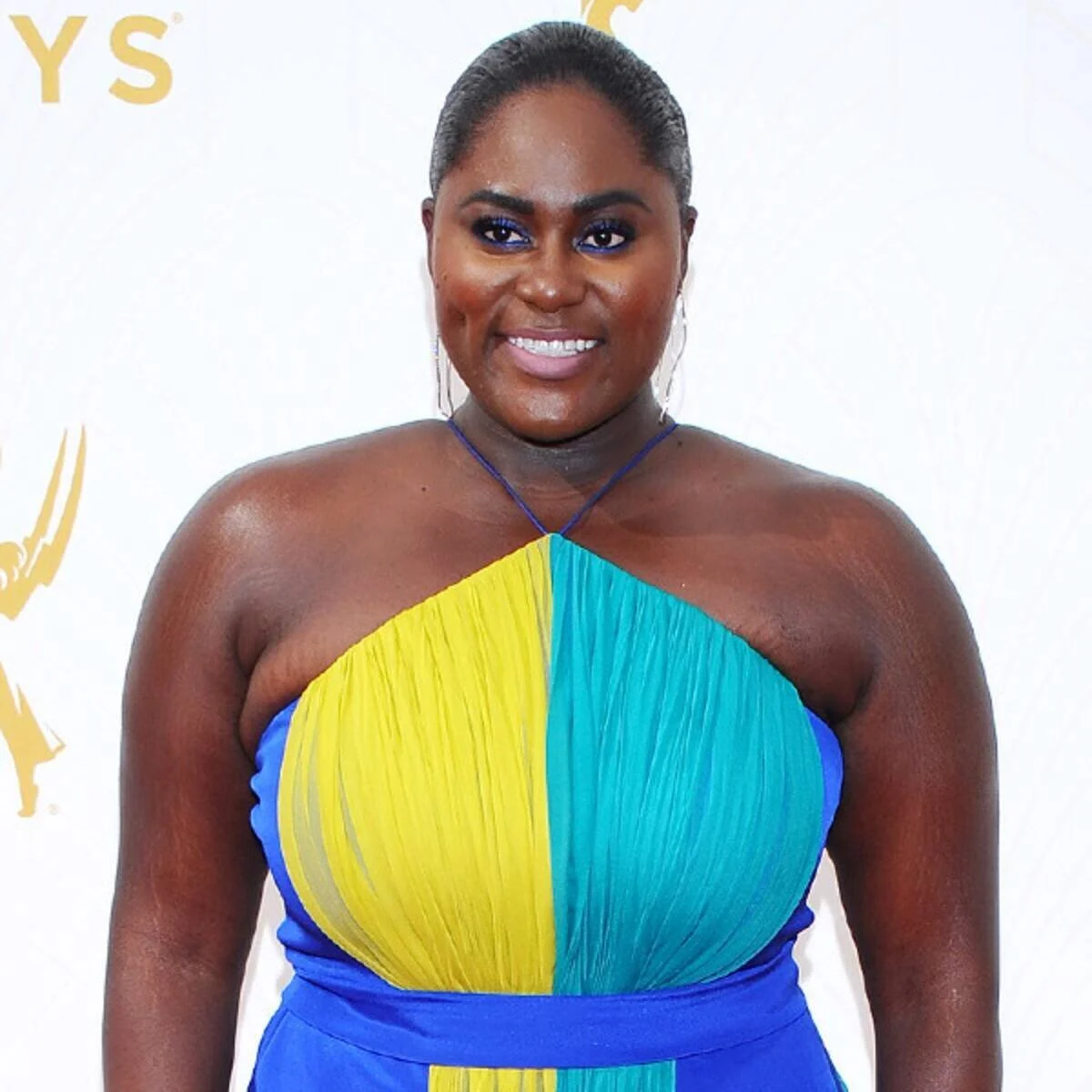
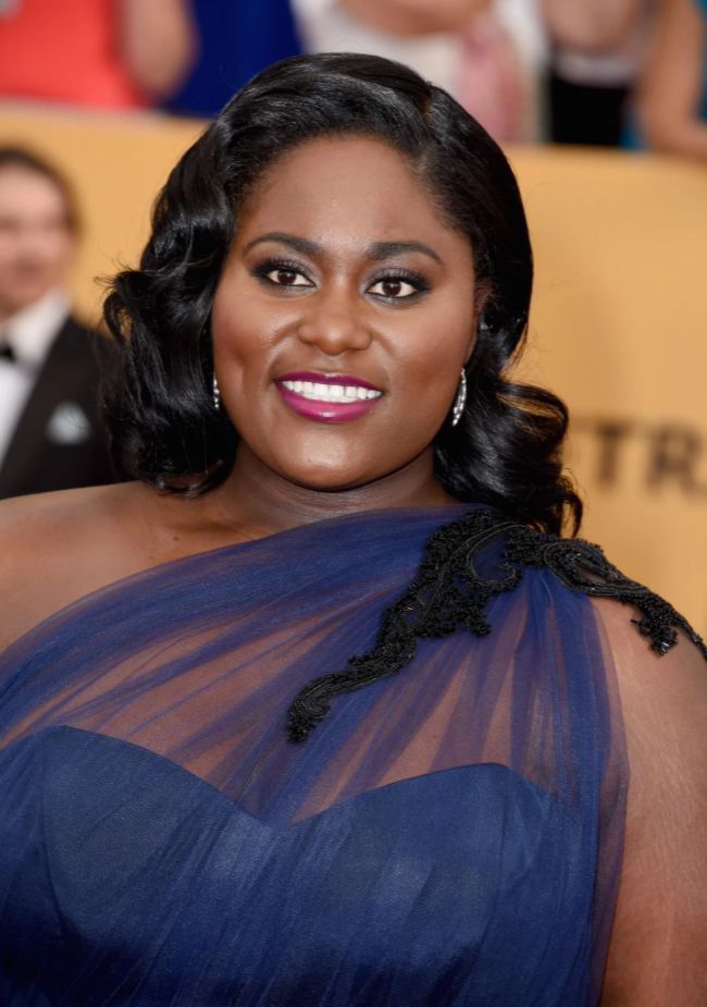
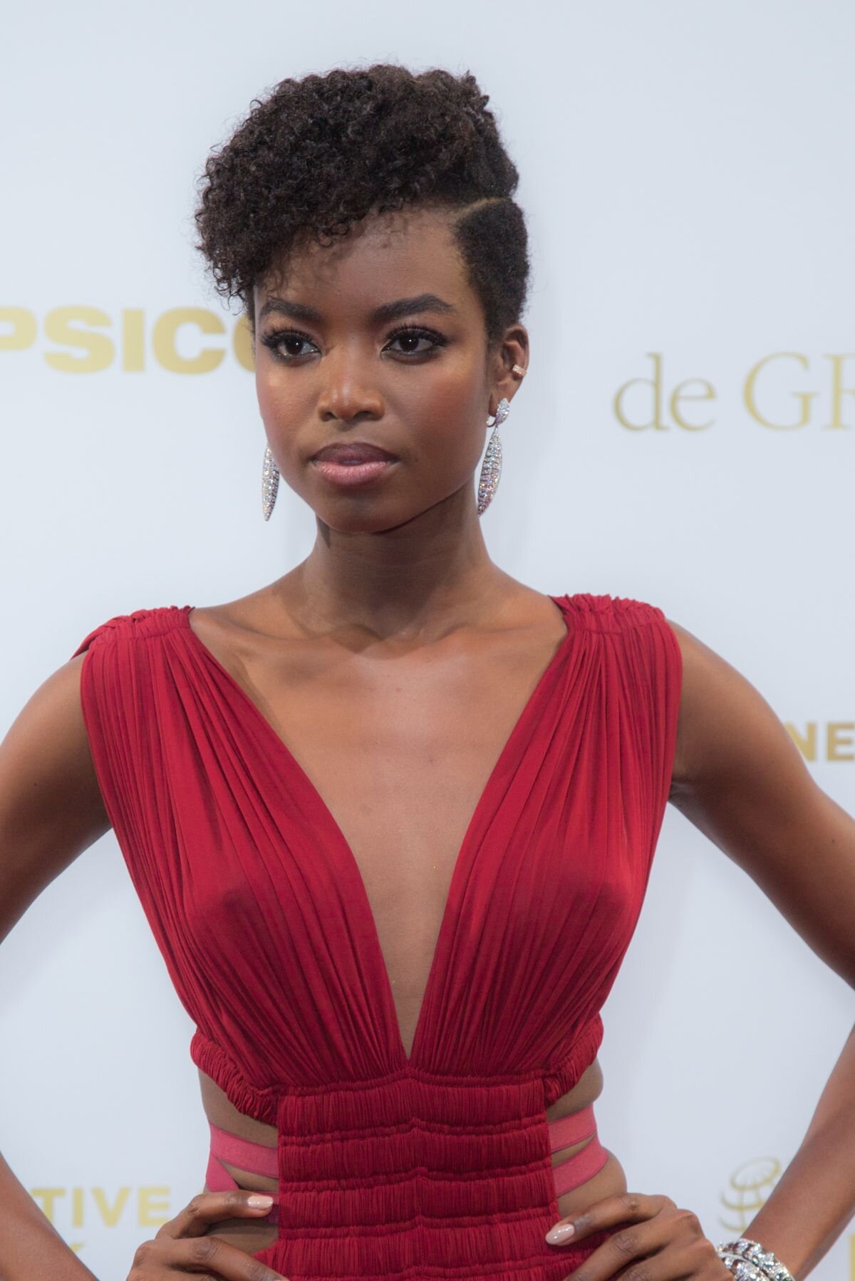
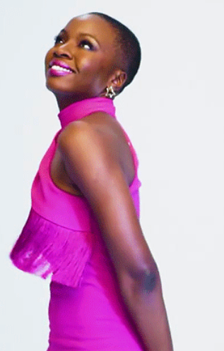
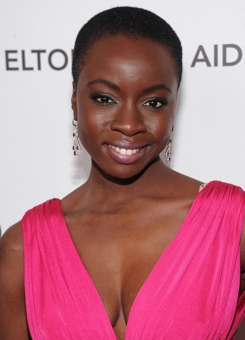
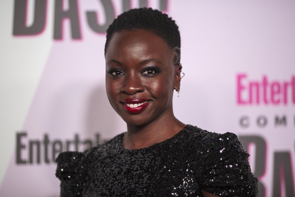
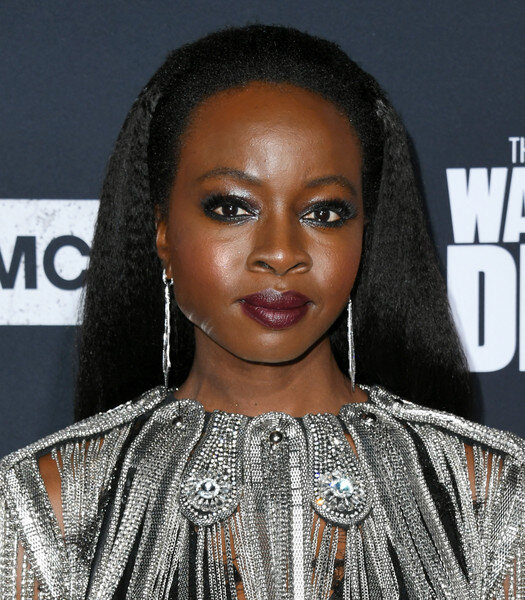
Introducing delightful actress Danielle Brooks.
Consider these two stunning red carpet looks:
The bright colours are fab.
The violet-cobalt eyeliner is fun.
If you google images of Danielle at the 2015 Emmys when she wore this amazing colourful dress, you’ll see pure styling joy.
She is loving the look so much - her spirit and confidence is infectious.
And why not?
She looks awesome and she knows it.
But as a case for natural beauty, these Bright Winter tones aren’t her best.
They look painted-on rather than part of the woman.
Unlike Dark Winter’s midnight navy, matte silver and rich berry-pink in the second picture.
Those colours are an extension of Danielle herself.
Resulting in a truly a jaw dropping example of Dark Winter majesty, might I add!
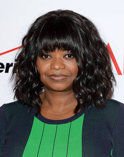
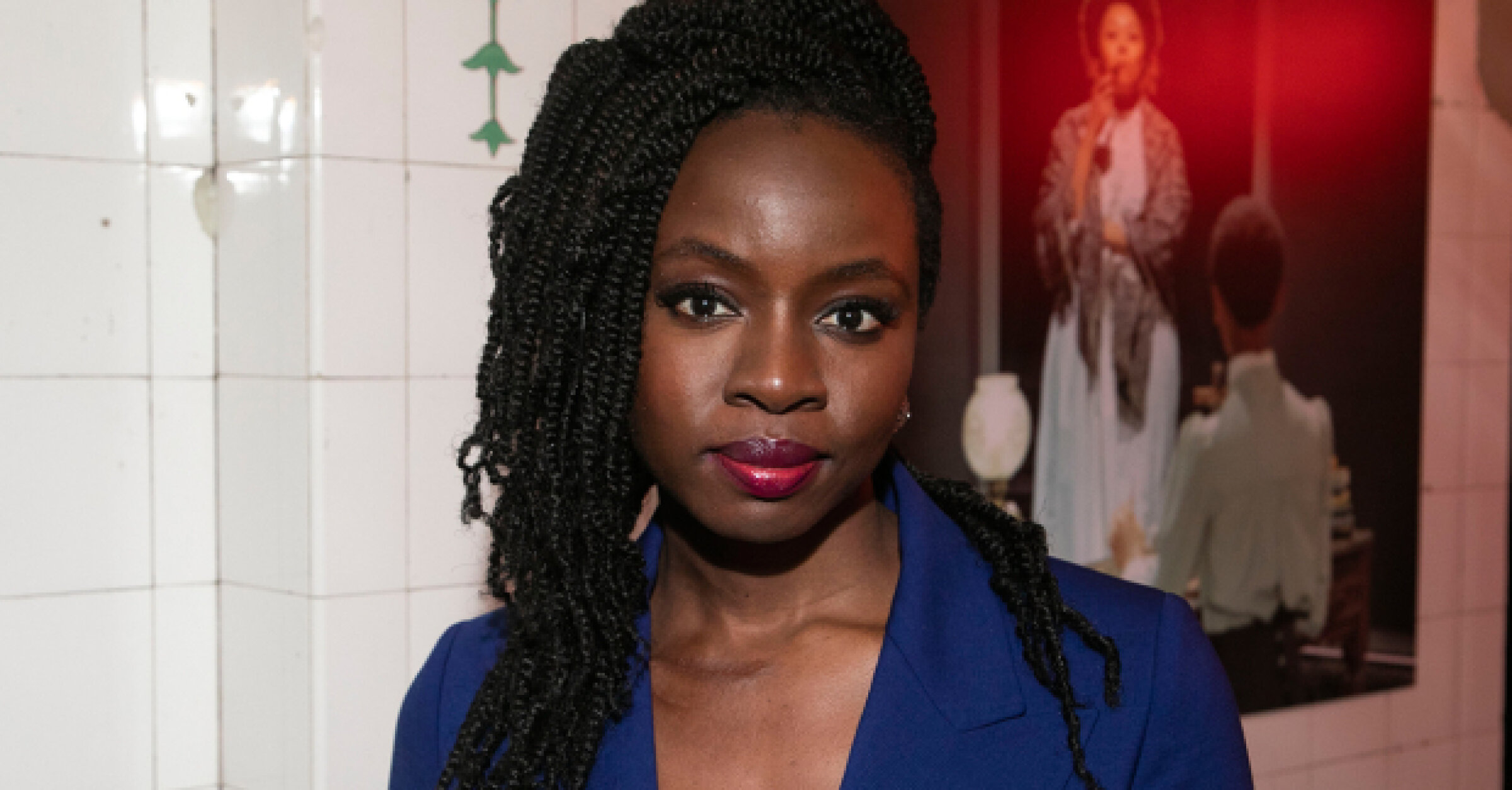
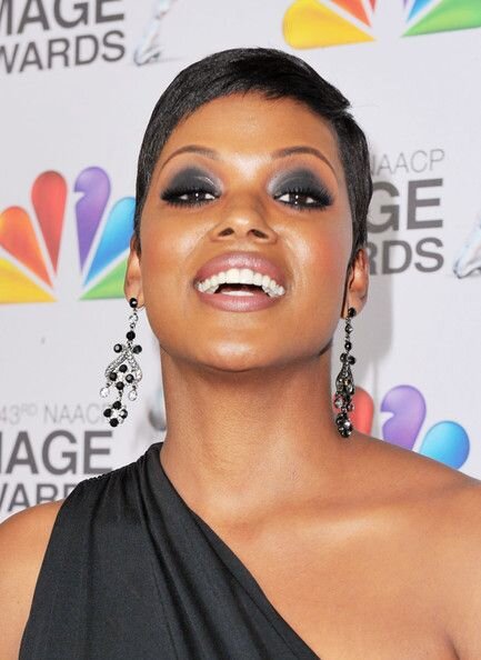
Just to labour my point, here are a few extra friends to remind us what good looks like for Dark Winter:

Bright Winter
Now we are familiar with Dark Winters and have met a few of their kind.
What does Bright Winter look like?
Who can balance flamboyant saturation and still keep the upper hand?
Angolan model Maria Borges to begin with:
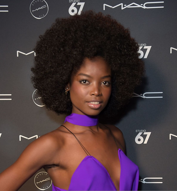
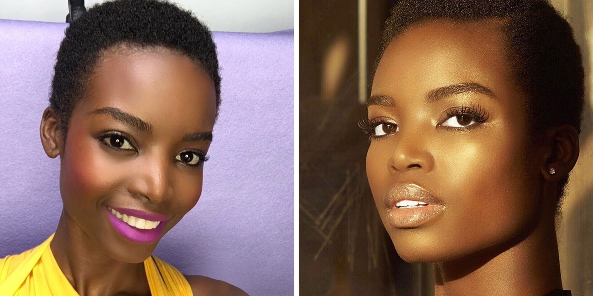
Maria is utterly memorable styled in her palette.
In Bright Winter, she has real individuality.
Maria makes wearing these colours look easy.
But is isn’t.
Bright Winters live on the edge of natural colour.
They can wear plenty of neutrals but they can also wander into the realm of intense, superhuman pigment.
Dark Winters can’t do that.
What happens when a Bright Winter dresses in Dark Winter?
This happens:
Glamorous yes.
Of course no one would deny Maria looks magnificent here.
But where’s the glittery sparkle and otherworldly energy?
Not to mention we are missing the luxurious smouldering soul of Dark Winter.
I’d venture these colours now seem a little drab.
And note how Maria’s features are no longer in sharp relief.
With that uniqueness flattened, I feel like she could be just another beautiful woman.
We have lost Maria’s sense of individuality.
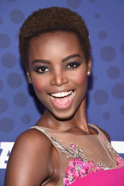
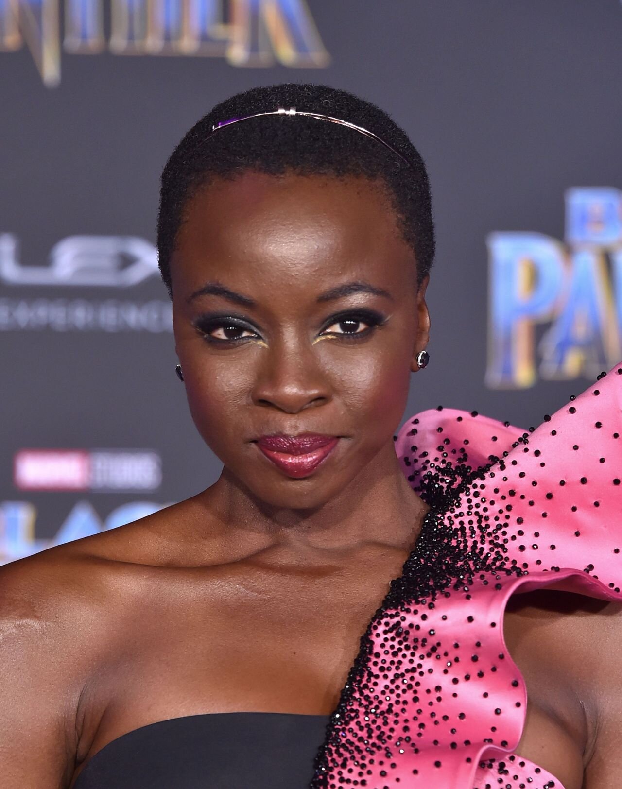
I am on Team Bright Winter for Danai Gurira too.
She is capable of balancing loads of saturation without the colour getting away from her.
Danai looks multi-dimensional and interesting in brights.
On her the extreme chroma is animated, not garish, with lashings of personality.
Danai doesn’t look as extraordinary in Dark Winter colours.
I mean the woman is a goddess, she obviously slays whatever she wears.
But these styling choices are removed from her natural palette so turn out less exciting and more Goth chic than if they were worn by a Dark Winter.
Autumn heat is dense and shadowy.
This is the wrong kind of warmth for high chroma magic that draws on Spring’s light-filled buoyancy.
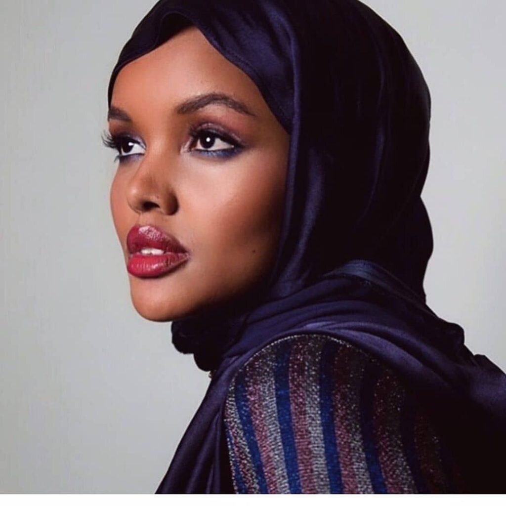
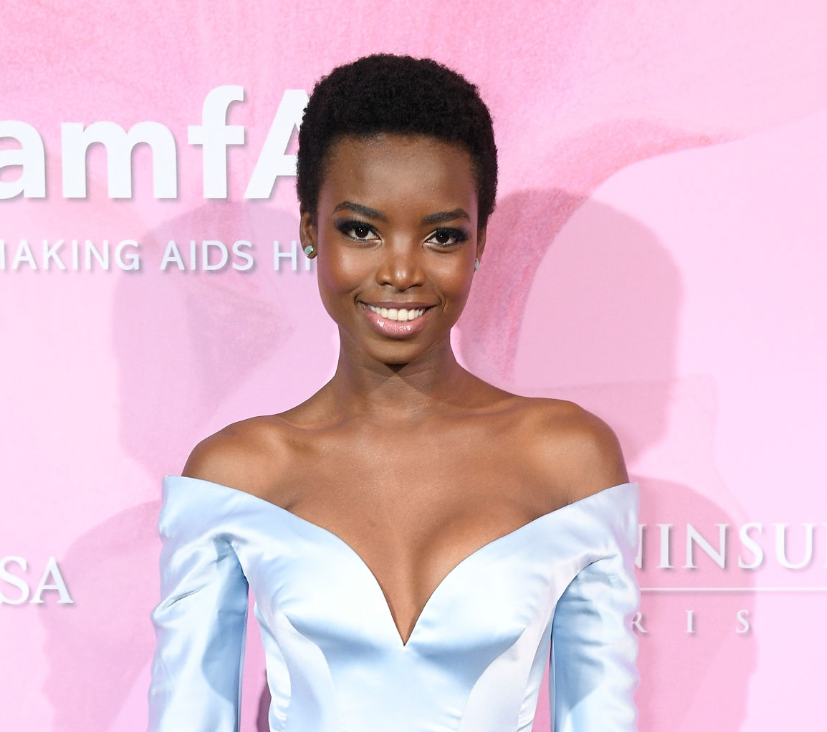
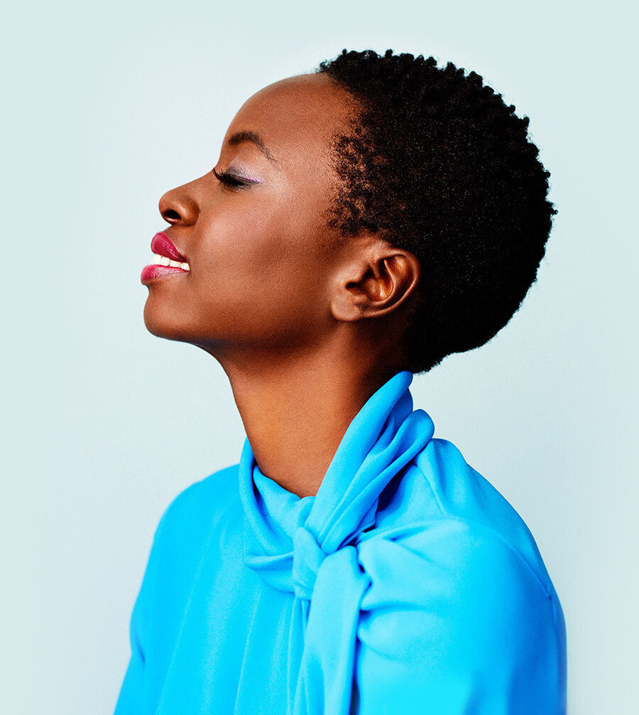
Meet actress Cassandra Freeman, who I also suspect may be a Bright Winter:
Plain black or white are fine for all Winters.
But look what Cassandra can do with a basic neutral just by upping the bright.
Pow!
The energy is fantastic.
That necklace would be too much on anyone but a Bright Winter
On Cassandra it adds life and finish to an otherwise run-of-the-mill neutral.
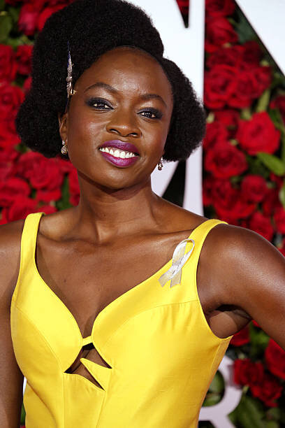
Now compare her vibrant cool-bright makeup with the smoky eye look.
Very heavy black eye makeup connects with the low value (darkness) of Dark Winters.
But remember Bright Winters need a touch of lift.
Black may be in their makeup kit but going super heavy-handed creates a punched-in look.
Still glamorous but missing a beat.
A unique trick with Bright Winters is that they often don’t actually look that bad wearing other seasons’ colours.
So perhaps they can stretch a bit further and get away with a teeny bit more than the rest of us.
But they will still lose the magic.
Bright Winters are capable of more pigment and saturation than almost anybody.
If you keep loading up on chroma and you still see the person, you’re onto something.
The Bright Winter miracle is how they practically transcend the limits of natural colour.
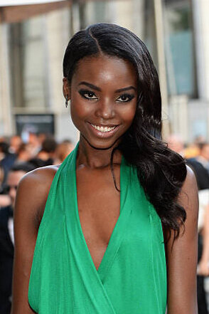
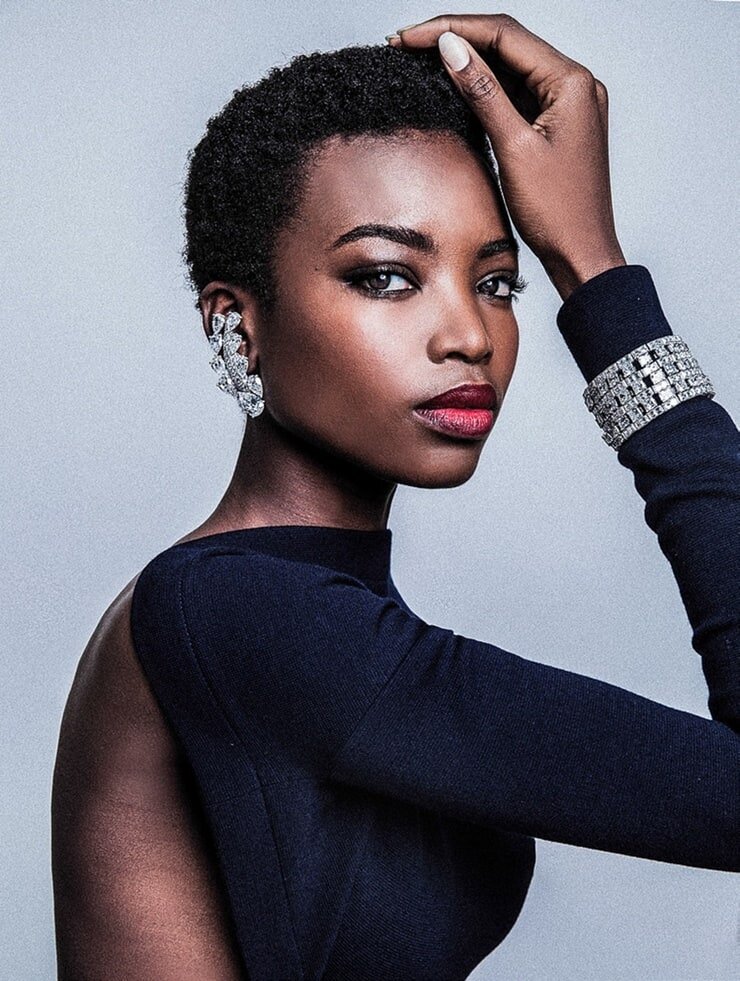
Look at this incredible example of what I mean:

I wish I knew the name of this stunning model because this photo is extraordinary.
To appear completely relaxed and natural in these outrageous colours - like she’s not even trying - well that really is an incredible feat.
Sure, this model is young and beautiful but that’s not the main reason she’s is crushing this colour combination.
She has got be a Bright Winter to pull this off.
Dark vs Bright Makeup
To finish I’ll run through a few final makeup looks.
Because for many people it is in cosmetics that the message clicks.
If you’re speculating about wearing another season, try on a lipstick and really think about the result.
The effect of colour placed directly on the face might resolve any ambiguity.
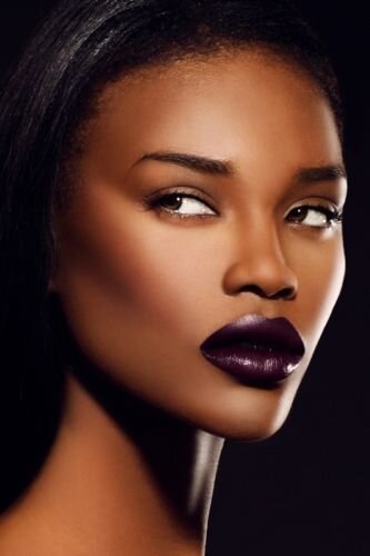
Dark Winter
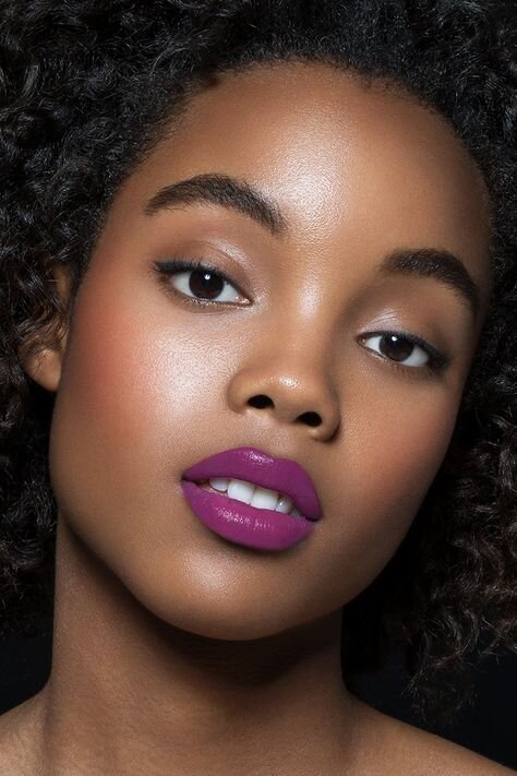
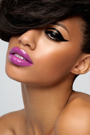
Bright Winter
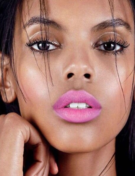
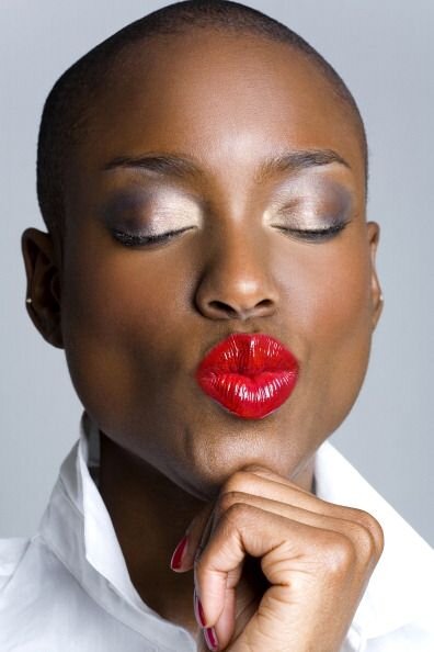
You might have noticed that sultry light really suits Darks.
Their mysterious depth is enhanced with a few shadows.
Brights on the other hand are much more flattered by a spotlight.
It’s like the photographers knew this when capturing these beauty snaps.
Final words
What’s my take home message for today?
Everyone belongs to one Tone only.
Sister seasons will be kind to you but they have their limits.
Only one palette will ever balance your natural pigmentation with mastery.
Remember, your colours have your back.
Always.
They will never betray you or muscle in on your moment.
They have total and utter loyalty to you.
#squadgoals.
